Glass Class

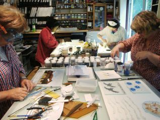
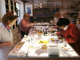
I held a long awaited Glass Class last Saturday. Two of the four students had been on my waiting list for at least a couple of years but one way or another we’d never managed to coordinate convenient dates until now.

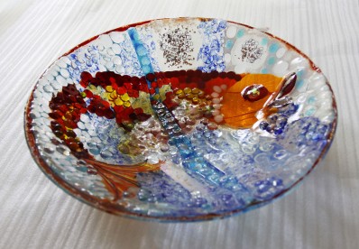
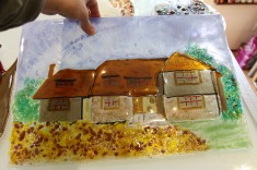
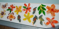
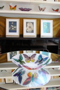
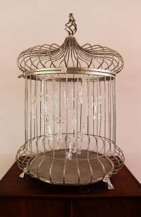
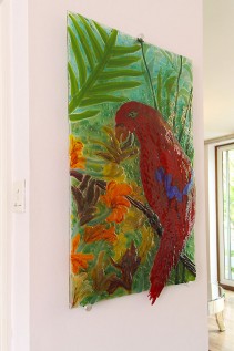
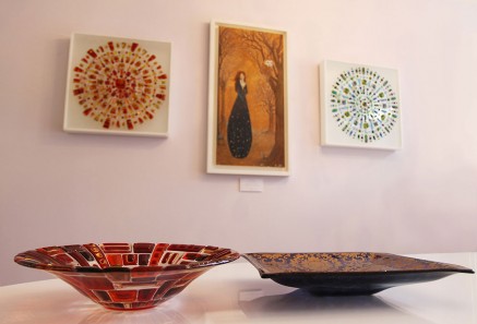
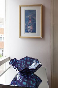
We sat in the garden discussing ideas over coffee at the beginning of the day and then it was to work. One student had been commissioned to make a picture of a lady’s house in glass so she worked from the photos and we worked out how she would give the glass a three dimensional feel. Another student wanted to try new decorative techniques and so she combined them into a bowl which was like a sampler with a different treatment in each part. The third student brought a floral arrangement as inspiration and we talked about ways that one could make flowers by casting or pate de verre. However with only a one day course as an opportunity to make something, we decided the easiest way would be to fuse into ad hoc slumping moulds made of fibre paper. She also made a glass basket in which to display the flowers.

The fourth student had been to my Glass Class a few times and had previously made a much-admired bowl inspired by a jellyfish her daughters had seen on a beach on the South coast. This time she came back with ideas of making a jellyfish-inspired mobile but we had to work out the technical issue of how to invisibly attach the jellyfish arms to the bell. Needing to create clear hanging hooks of glass on both sides of the slumped bell was a challenge but after discussion, she tried something I thought might work though I had never attempted it before… and it worked a treat!

Inspired by honeymoon

Made-West-Dean

I will be unveiling my latest product at the West Dean Design and Craft Fair held in association with MADE on the 19th-21st June. This is a fairly new event, but it proved very popular last year and, as I will be exhibiting with MADE London later this year, it will be the perfect preparation for the bigger event which happens in October. I don’t know quite how to describe my new product, without showing photographs – and those haven’t yet been taken! The closest description I can muster is a little folding folio made of glass with pretty images and quotes.

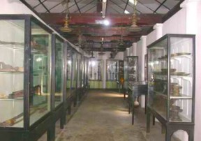
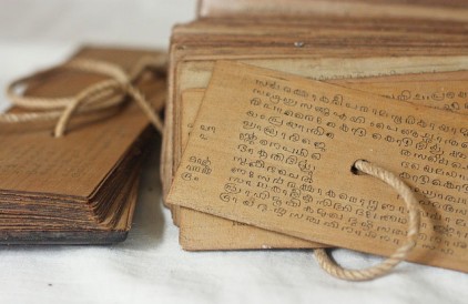
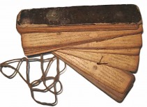
It was inspired by some ancient books I saw in the National Museum in Kandy, Sri Lanka, which we visited while on honeymoon. These manuscripts were made of palm leaves that were stitched together with thread to create a fan-like book which were unfolded to be read.

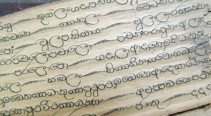
I used to work as a typographic artist for various advertising agencies and I have always been very interested in text and typefaces. In Sri Lanka there are two written languages, other than English, and I was absolutely entranced by the decorative Sinhalese and Tamil scripts. I took lots of photographs but, frustratingly, we lost most of our honeymoon pictures in an exploded computer drive a few weeks after our return.

Look out for photographs of my new glass folios coming very soon.

Every Two and a Bit Years

My fellow Teepee artists and I have just come back from a weekend in Stourbridge in the Midlands to see the Glass Biennale at the International Festival of Glass. As the name suggests, this has always been held every two years since 2004 until last year when it was put on hold because the building that housed the exhibition at the Ruskin Glass Centre needed renovating. Having become a regular fixture in the glass calendar, the Glass Biennale at the International Festival of Glass was always looked forward to on the August bank holiday weekend, but for some odd reason the new director this year decided to hold it instead in May. We were told this was so people didn’t have to wait a full three years before the next one but, frankly, this seemed an unnecessary complication. We would have rather waited the extra three months to see the glass in the sun. So it could have been the occasional drizzle and cold or it could have been the tighter hold on the finances by the new director, but somehow the whole festival felt a little flat.

Biennale

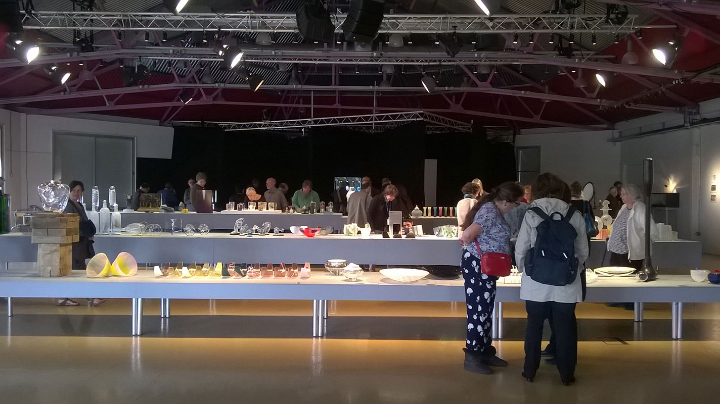
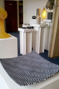
I was not alone in finding the layout of the Glass Biennale exhibition a little strange. There seemed to be very few wall panels, and also a surprisingly high proportion of object based work, but I felt that the three long tables with objects squeezed onto them didn’t really present the glass in its best light. Curator Matt Duran had apparently explained to the audience at the private view the night before that the layout was meant to be read as a kind of stage set, and I could understand this while we were sitting on the chairs that had been laid out like an audience for the glass show. However once I stood up and walked around to actually look at the glass, it felt more like a table sale with pieces jostling for space.

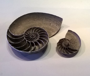
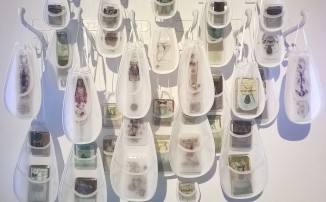
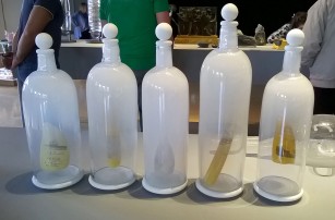
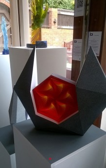
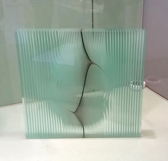
Despite what I thought was a great shame that each object had not been given space to breathe, there were some interesting juxtapositions set up because of the proximity. One area on the tallest table was given over to glass which looked more like archaeological artefacts that had just been dug up and brushed down. Rachel Elliot’s ammonite form ‘Crude’ was lovely and quite different from what she normally makes. I also really loved James Masktrey’s “Shackleton’s Scrimshaw” which were five bottles which looked like they were filled with sea mist and Shackleton’s historical documents suspended inside. The concerns with history and memories were echoed in Lisa Catherine Sheppy’s suspended ‘Lost Pockets’ which hung screenprinted and fused glass nuggets in sheer organza pockets. I also really liked the overall winner of the Biennale, a gorgeous cast piece by Ashraf Hanna that I just wanted to stare into and immerse myself in its depth of colour.

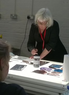
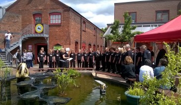
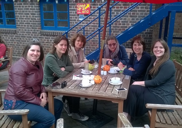
We wandered around the Ruskin Glass Centre in the afternoon, watching a painting demonstration by the delightful Cappy Thompson who had run a masterclass earlier in the week and listening to a choir who sung harmoniously as the sun came out. We saw Georgia Redpath’s lovely installation which showed the four stages of making her complex cast pieces and then had a chat with her in her studio, admiring her work. We had lots of other places in and around Stourbridge to visit as part of the International Festival of Glass. We saw an engraving exhibition at the Red House Glass Cone after which we sat outside for a chilly cup of tea as actors in historical dress finished their work showing visitors round the museum and headed home in full costume.

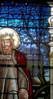
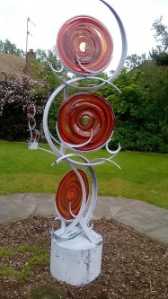
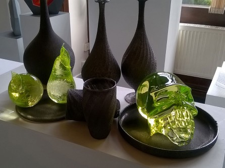
Following this, came a Church Crawl, visiting various churches in the area for their own wonderful stained glass such as this example from the Wordsley Methodist Church. In fact in the back of the church there was an exhibition run by Bruntnell Astley. Putting on an exhibition when one is a photographer, as Simon Bruntnell is, must be made easier by the fact one has so many wonderful images to choose from. It seems as though Simon was making a good job of it as he had sold quite a number of pieces, possibly more than at the Biennale. Many of his artists were also showing at the Biennale, including our old friend Nicholas Collins. We spotted a wonderful Georgia Redpath piece that had sold – it was being shown with a cardboard base, but there were arrangements for the base to be cast in bronze later on. The exhibition continued into the garden where there were some grand Jenny Pickford glass and metal sculptures. My favourite pieces of all were a delicious collection of objects by Elliot Walker, darkly textural black blown shapes, and a glass skull cast in a delicious lime green glass.

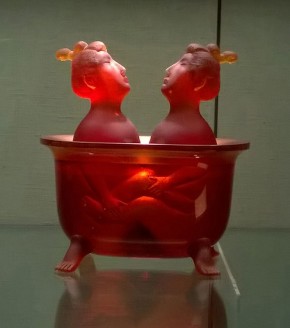
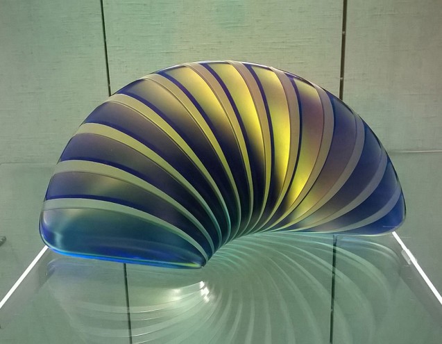
On Sunday we had just enough time to squeeze in a dash around another church despite the imminent baptism that was about to happen and a lecture back in the Ruskin Glass Centre before lunch. Before setting off back to London we went to see the exhibition of contemporary Hungarian Glass. A small but perfectly formed exhibition, we were debating between us how Péter Borkovics made his wonderful cast piece when the curator suddenly popped up in our midst and explained the technique in terms that made it seem almost simple compared to our convoluted imaginationary methods. We marvelled at the skills required to make ‘Japanese and Chinese’, a rather saucy depiction of two figures in a bath. I fell in love with a smooth jewel-like curl of cast glass by Lazslo Lukacsi, and its subtly irridescent surface inhabited my dreams as I snoozed in the car on the long journey back to London.

The Final Judgement

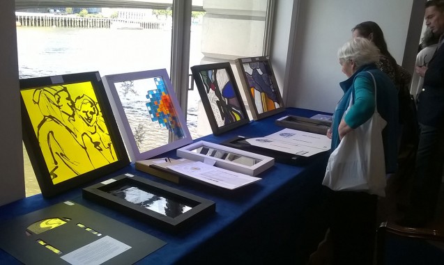
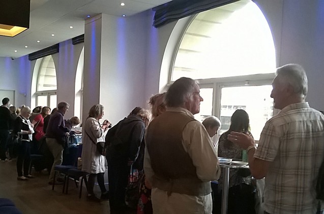
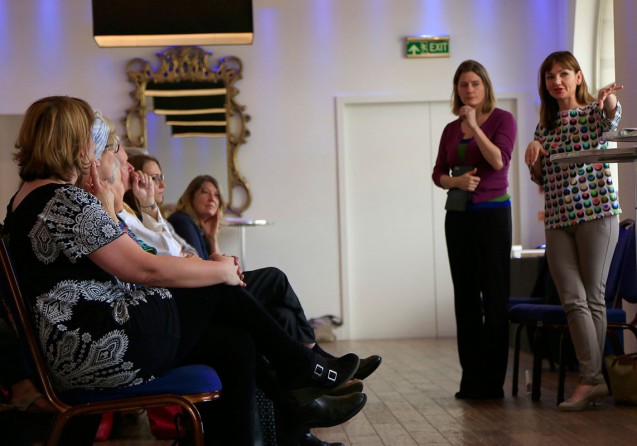
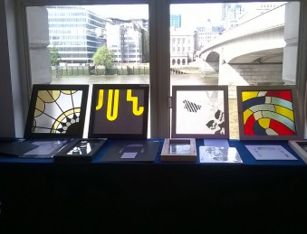
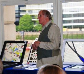
The Stevens Competition prizegiving day was on Tuesday and though we were one judge down, we had a lively seminar between Helen Whittaker, Douglas Hogg and myself, the three judges that were left. The seminar is traditionally held at the magnificent Glaziers Hall on the river at London Bridge, where the competition entries are spread around the River Room for students and visitors to look at before a group discussion. With fewer entries this year than in previous years, we were able to lean all the entries against the windows with a wonderful vista across the River Thames, and it was lovely to see all of them at once, as opposed to the judging day when we were shown the panels in groups of six.

Just before the students came in, we three judges had a conflab and decided that the chairs were too widely spread to create a sense of intimacy in the ensuing discussions, so we rolled our sleeves up and tottered here and there moving the furniture around in our high heels (Helen and I, that is – Douglas had chosen more sensible footwear!).

And then it was time for the students to enter to hear our verdicts and our feedback on each of the panels on show. I found my outlook subtly shifting gear from the critical judging eye that we had employed when filling out the mark sheets for each panel, to the softer, more educational stance we needed to take in order to deliver our feedback to the artists. Helen voiced my own feeling that at times like this, we feel we are no more qualified than anyone else to proclaim which panels are good or bad; certainly for my part, it feels like not long ago that I was one of the students waiting to make sense of the feedback delivered about my own efforts in the Stevens Competition. However we were brought into do a job and, on the whole, we largely agreed about the general verdict on most panels.

It was lovely to hear the students themselves explain their own motivations for the designs and to see the genuine pride in the faces of the winners. However a downside was hearing from one student who came up to me after the seminar and said she felt she had failed because the sum of her marks in the various judging categories added up to less than 50% of the total available marks. She felt dejected and expressed doubts that she’d want to enter the competition again. I tried my best to assure her that the marking system was not necessarily a reflection of the quality of her panel, but I suspect she thought I was just back-pedalling. I have thought about this more since that day, and I stand by what I was trying to explain to her. When marking panels which are set against each other in a competition, one marks differently from how one would assess a panel on its own merits. It is the difference between the judging eye and the educational stance, that I was alluding to earlier. When one is marking to judge, one has to ensure the aggregate marks are differentiated from panel to panel…. in other words, one starts by imagining the panels in order of strength in each criterion and one mentally gives, say, the eleventh panel out of the sequence of twenty one a mark at roughly 50%. Then the ten stronger panels in the imaginary sequence would be graded above 50% and the ten weaker panels would be graded below. That is not to say that the eleventh panel is only half as good as it could have been but, for the judging process, the difference between the marks aggregated by each panel is more important than the marks themselves.

Unfortunately the girl I spoke to didn’t understand that this was what the marks represented and took her below 50% mark to be a damning indictment of her work. It was a great shame because her work had a lot of excellent qualities, but in this case they were just not quite right for this commission for Swansea University. As I said to her, if the commission that has been discussed by the Glaziers as a possible candidate for next year’s competition goes ahead, then I would anticipate her particular style would be very well suited to that competition, and I hope that she reconsiders applying again.

One Hour Out

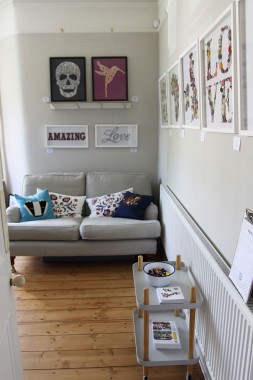
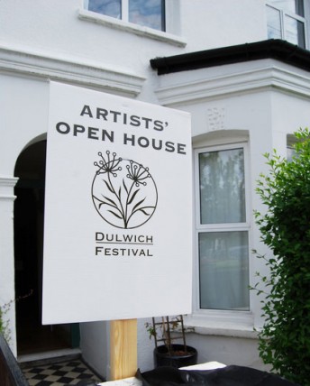
Exhibiting at the Dulwich Open House can be exhausting but I’ve learned to take some time to go and look at other houses. I had just an hour to discover some local treasures, so I stuck to my immediate vicinity.

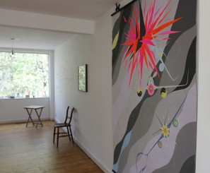
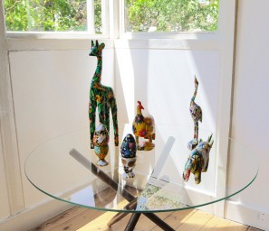
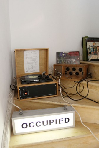
Right on my own doorstep, The Stromboli Group had cleared two floors of another Pymers Mead house to stage ‘The Occupation’, a mixed media group exhibition of work from seven different artists. I rather fell in love with Laura Orsini’s decoupage animals which were sunning themselves on a table in the window.

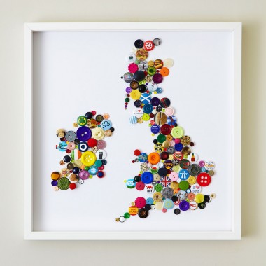
Next I dropped in on Vicky and Hannah from Hello Geronimo who make contemporary prints and wall art from buttons. Their map of Britain created with colourful buttons made me smile, especially when I spotted the Fab Four badge to stand for Liverpool.

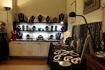
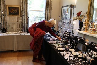
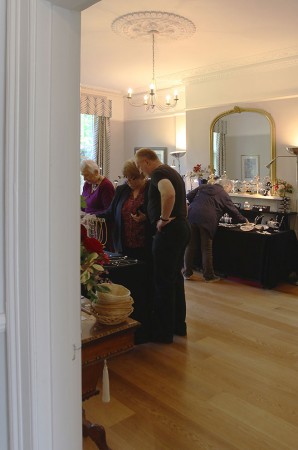
Turning back towards West Dulwich I popped over to see Catherine Mitchell who sets up her living room as a shop three times a year to sell her lovely jewellery to a loyal crowd. Her beautiful house makes the perfect pop up boutique for her jewellery made of semi precious gems and freshwater pearls.

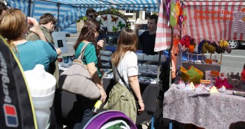
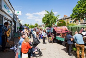
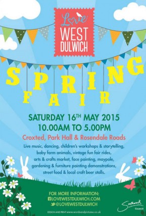
Next I thought I should check on my dutiful son who was running a stall for me at the Love West Dulwich spring fair. He appeared to have recruited a friend to help so I was reassured that they were managing just fine selling to the shoppers in the sunshine. The fair was great with vintage funfair rides and choirs singing as I passed… as I found out later there was a footfall of 3000 in our locale for the fair so there was a great turnout.

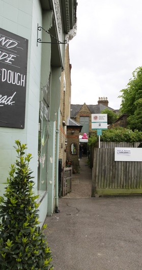
Finally I went to investigate the building behind the Dulwich Bakery, which I’ve always wondered about. The various buildings between the bakery and the row of houses have always intrigued me as I’ve always thought they’d make a great studio set up…. and sure enough, that’s exactly what they’re being used for.

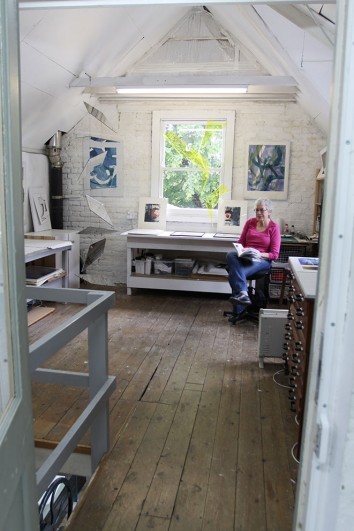
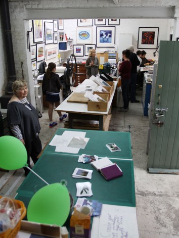
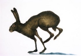
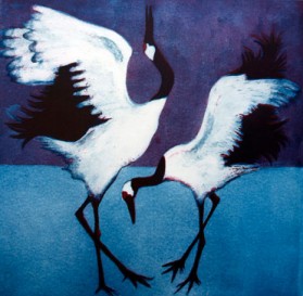
Orginally the outbuildings for the Victorian bakehouse housing the ovens and the kitchens, these buildings are now being used by the Half Moon Studios who are a group of printmakers that moved from Herne Hill. And what a wonderful set up it was! I spent quite a while chatting with Sonia Rollo and Susie Perring, both of whom turned out to be the mothers of girls I used to know at primary school!

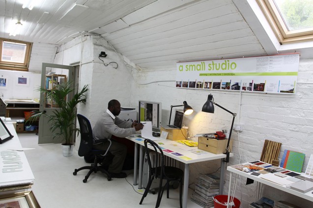
Upstairs were further spaces occupied by more artists and I was thrilled to discover a micro architectural practice which specialise in sustainable urbanism. A Small Studio is run by Helena Rivera but her collaborator Roger Allen was representing her on the day and so I had a good chat with him about a very exciting project that could be in the offing for me but, for now, will remain secret.

All in all, an hour well spent.

Two Sunny Weekends in May

The weather has been unusually capricious – yesterday there was bright morning sunshine, torrential rain at lunchtime, a warm sunny afternoon followed by a sudden spate of hailstones (!), and then a sunny but absolutely freezing cold evening. And it has been this changeable for the last two weeks, but somehow – for once – the Dulwich Open House event struck gold with two weekends of balmy summer sun.

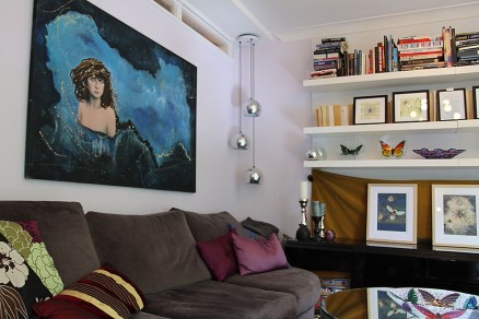
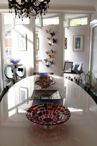
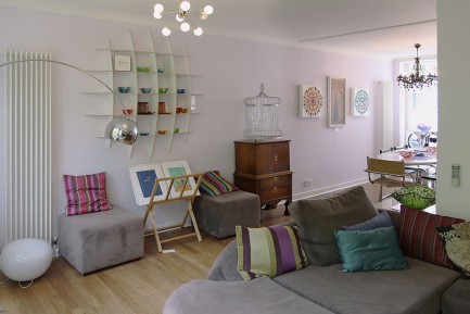
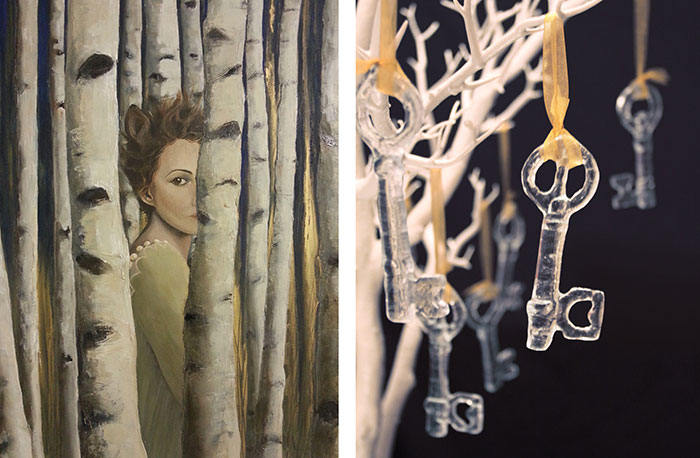
My house looked gorgeous – even if I do say so myself! The walls were adorned with Charlotte Kessler’s exquisite paintings and my glasswork and until the art was up on the walls we hadn’t quite appreciated how well our work goes together.

Bees and butterflies had a strong presence in the house and our combined work created a very feminine spirit in the space, picking up on universal themes of love and nature.

Colour is very important to both of us, and it was wonderful to see how the colours seemed to reflect

On the second weekend I managed to get out and have a look at some of my neighbouring Open Houses. Read about them here

Built from Scratch

On the Bank Holiday, I had to make an unexpected trip down to West Sussex to deliver work. Strangely, two days earlier my mobile phone had gone crazy and was inexplicably sending texts to a client of mine instead of the friend with whom I was trying to arrange my Friday night plans, but it was timely as my client mentioned that the windows I made for him last year had finally been installed. This gave me a second reason to go down to West Sussex, so I jumped in the car and made it down in record time.

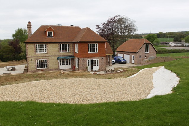
I was delighted to see the almost completely finished house, a magnificent building which the clients had designed and built from scratch on a lovely site near the Cowdray Estate. My windows were designed for the porch so they were the last things to go in, to avoid any builders’ accidents going in and out of the building.

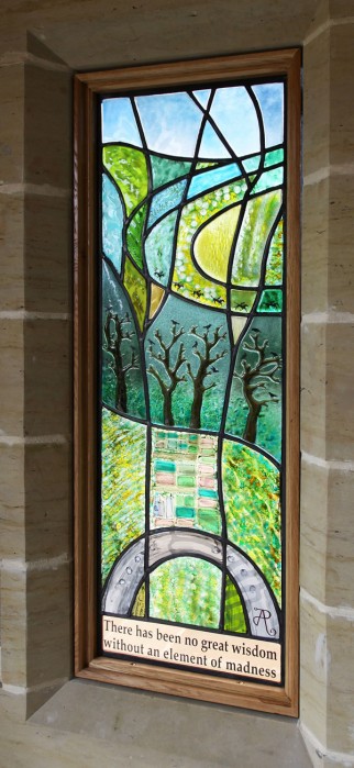
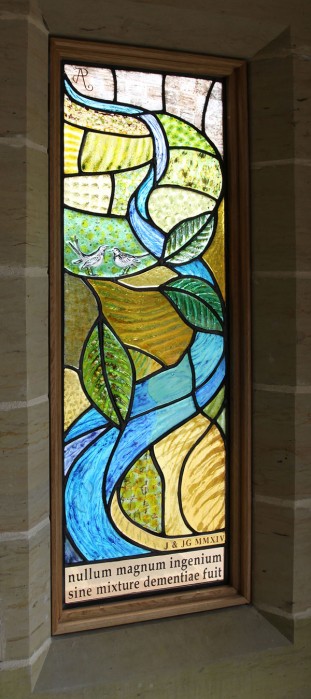
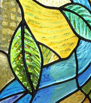
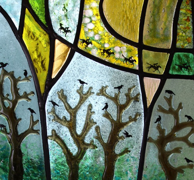
I brought my camera to capture the windows in situ and I was glad to see that the light was balanced well and the panels looked bright and colourful even on this slightly overcast day. The porch acted a little like a lightbox with the light coming through the glass into the darker space within, and with a strong light inside the porch the windows will look lovely from the outside at nighttime. The constant frustration for us glass artists is that our panels can’t simultaneously look good from inside and outside but, such is the nature of the material as it always looks its best viewed from the dark side with the light flooding through.

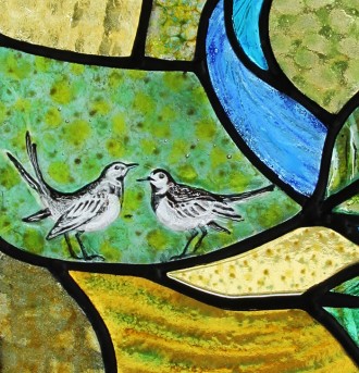
However with the panels illuminated, lots of detail could be seen up close and these panels were designed to reward closer looking. The clients have an affinity with racehorses and wanted references for this to be subtly included in the panels, as well as a couple of wagtails, one of which had flown into the outbuilding while it was being constructed. The features in each of the panels were inspired by the topology of the surrounding area, so as visitors come in through the porch they will see echoes of the land behind the house. The clients have always owned cats, and so I included a hidden cat in the ‘Water’ panel – I had assumed visitors would spot it fairly quickly but apparently it consistently evades identification. Can you see it?!

Read about the making of the panels here.

The Artist is in Residence

I am in the unfortunate position of having every single member of my family – both parents, my sister, my husband and my son, as well as a good friend – celebrate their birthdays in the month around my annual Open House. It always makes life impossibly busy in April and May, both workwise and socially, as one birthday after another is celebrated.

However I reckoned by the end of April, when my other half turns a year older, I’d be a bit fed up with nonstop work, so I decided to give us both a couple of days off in celebration and I booked a little break in a boutique hotel. We packed our bags and headed off to central London with the Artist Residence hotel in Pimlico our destination.

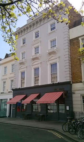
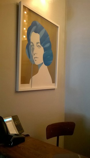
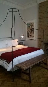
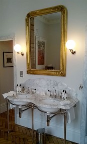
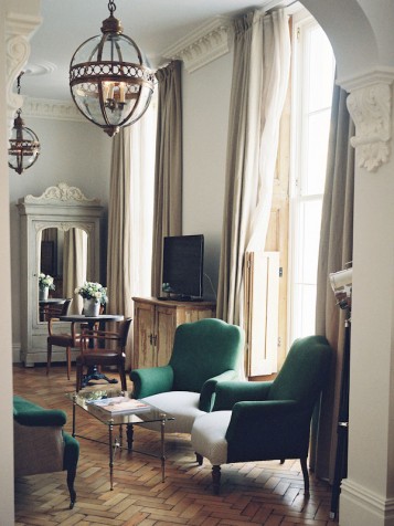
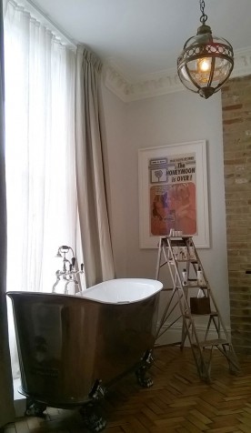
We strolled down from Victoria station feeling distinctly like tourists in our own city, and as we approached the building we were marvelling at the mammoth first floor windows in the Victorian building. The reception gave a flavour of the hotel’s characterful decor – a heady mix of reclaimed rustic furniture, luxury Victoriana inspired fixtures and modern graphic artworks. We were delighted to discover that we had been upgraded to the Grand Suite, the room which boasted the three enormous windows, and the eclectic urban rustic theme continued in here with a wonderful open plan room with a magnificent claw footed bath.

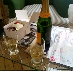
We drank champagne from the hotel beakers, ate cupcakes and I had the most indulgent 4pm bubble bath looking out onto the streets of Pimlico below.

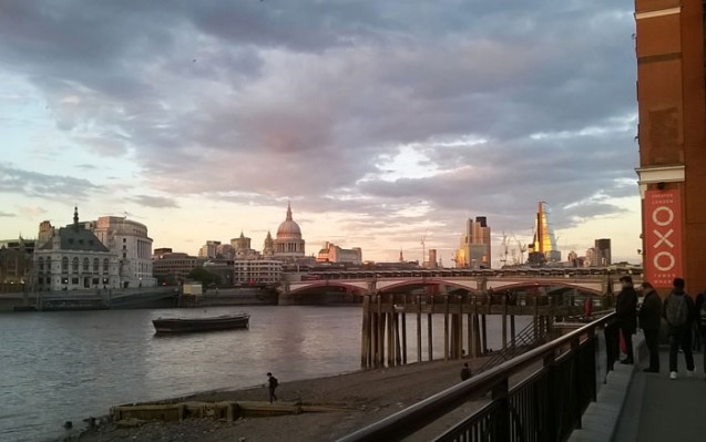
I had planned to take my man out to a private view of my friend Eryka Isaak at the Skylark Gallery near the Oxo Tower that evening and then dinner at the Mondrian Hotel next door, so I thought it would be rather stylish to travel down river Bond-style in a boat from Millbank and alight at Blackfriars Bridge. I had left us plenty of time to get to the pier, but somehow my efforts to dress up in heels and a nice frock was our undoing. Between being a bit drunk from the champagne and trying to manage the verging-on-obscene thigh-high split in my dress, I got flustered and took us to the wrong bridge, resulting in is missing the last boat of the evening. So after a frankly annoyingly long walk in high heels, we arrived at the gallery flustered for Eryka’s private view and late for supper. James Bond would have managed that journey with more panache!

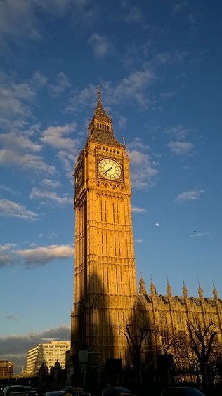
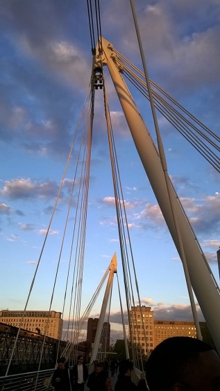
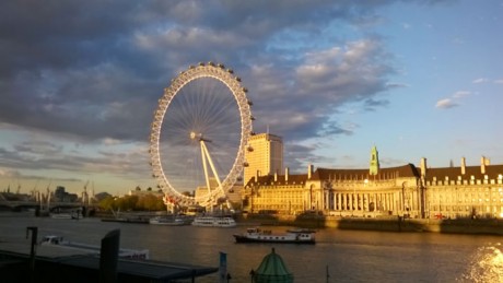
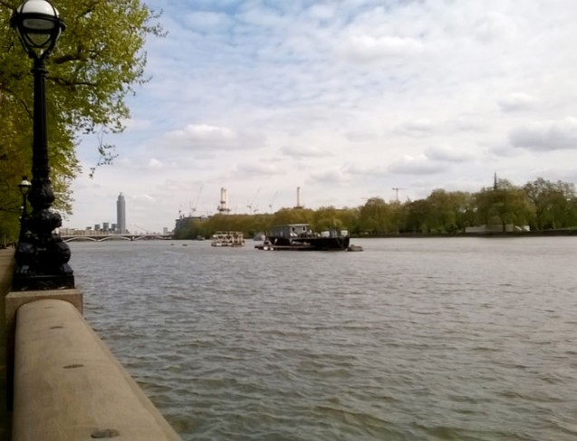
However the walk afforded me a few lovely photo opportunities for what was a stunning sky in perfect evening light. And after a lovely meal at the Mondrian we took a cab back along the river to our fabulous hotel.

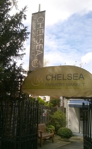
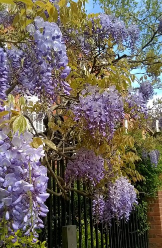
The next morning we took a stroll to Chelsea Farmers Market for brunch. I lived in Chelsea for about 15 years but I haven’t often been back since and so it was a bit of a walk down memory lane as well as a lovely urban ramble through the back streets of Chelsea, past the wonderful wisteria clad entrances to the grand houses of Cheyne Walk and back to Pimlico along the river.

Artists’ Open House


In less than three weeks 200 artists’ houses in and around Dulwich will be opening their doors to a stream of visitors as part of the Dulwich Festival. The Artists’ Open House is now an established event in the calendar and people come from far and wide to visit the artists and see (and buy) their work in the context of their own homes. Local businesses are now involved and so you will find art installations popping up in estate agents or local cafes, as well as a handful of markets and fairs which centre around the Dulwich Festival.

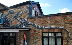
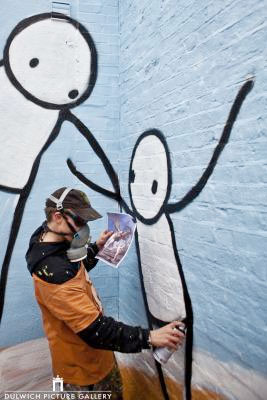
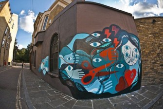
Over the last couple of years there has been a coordinated effort by the Dulwich Picture Gallery to invite twenty of the world’s leading street artists to study their Baroque paintings and reinterpret them in their own style on walls and pavements around Dulwich, and during the Festival there will be a guided walk with the organiser to take in this Dulwich Outdoor Gallery. There are also numerous talks, walks, recitals and demonstrations happening all around the area which draw thousands of visitors to the Dulwich Festival.

Charlotte Kessler | Alex R
I am celebrating my tenth year in business and so I thought it would be nice to open up my space to some other work. Charlotte Kessler of Lemonstone Art paints mesmerising images in oils and acrylics, drawing on themes of love, nature, dreams and freedom of spirit. I fell in love with her work just before Christmas when I bought two of her prints for my family, and as they sat so well with my own work I have invited her to co-exhibit with me during the Artists’ Open House. Together we are showing a captivating collection of work across three storeys of the house and studio which will explore the magical interplay between glass and paintings in a space bursting with poetical imagery and wonder.

Five Houses
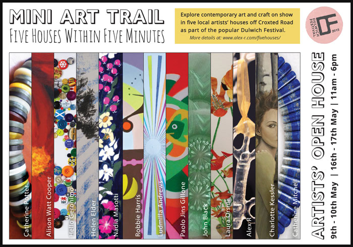
We warmly invite you to come and visit, and as further encouragement we have joined forces with four other artists’ houses in the immediate vicinity to create our own cluster of exciting work within the larger event. Open across two weekends, our ‘Five Houses in Five Minutes’ is a mini trail which will take in jewellery, print and collage, upcycled craft and mixed media, and fine art as well as my glass. We hope you can come and bring your family and friends to enjoy a day out in Dulwich.

Artists’ Open House: 9th-10th May and 16th-17th May, 11am-6pm.

 The Glass Studio | 47 Pymers Mead, London SE21 8NH

A Gift and a Curse

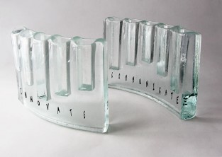
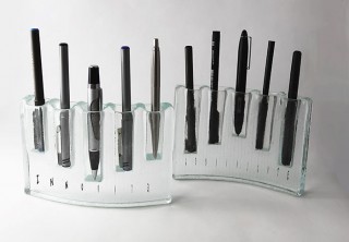
My last blogpost expressed my frustration at the lack of polish in the students’ presentation of their competition proposals. While I was away from the studio last Monday judging the Stevens Competition, my little kiln was busy firing my own glass samples for a competition. The theme of the competition was Innovate | Communicate and entrants were asked to make a pair of favours for a Banquet at Mansion House (see all the competition entries here).
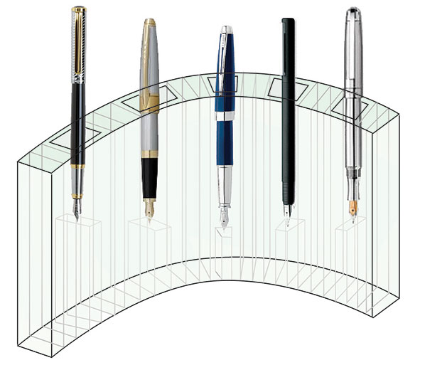
Design for penholder
I had considered the theme and I wanted to make something which could be kept on a desk – the place where most designers, thinkers, writers and business people communicate and innovate – so I designed a cast and slumped matching pair of curving glass pieces which were to function as contemporary desk holders for pens. The words “Innovate” and “Communicate” were printed within each respective pen holder. I had spent a long time making little samples trying to work out the correct sizing to fit even the biggest fountain pen and I finally made a finished version which looked good and felt stable.

However when I went to package it in my signature giftbox, I realised I’d miscalculated something as it was still slightly too big to sit comfortably in the box. I was running out of time before the deadline – cast pieces always take forever in the kiln – and my brain went into overdrive to come up with clever ways to support the glass in the giftbox at an angle which just allowed it to fit.

Then a wonderful email arrived in my inbox from the organiser of the competition saying that she was extending the deadline by a week. What a lovely surprise! I had plenty of time to make another pair at the perfect – slightly smaller – size. With the luxury of time on my side, I could even tweak and perfect the making technique.

So when I chatted to John Reyntiens on Monday – one of my fellow judges who also happened to be entering the competition – I was confident of easily making the extended deadline of Friday. And yet, later that week when I opened up the kiln to inspect my perfected pieces, my heart dropped through the floor and the cursing that was to be heard would have made any West Dulwich resident blush….. I had made a stupid, stupid error!
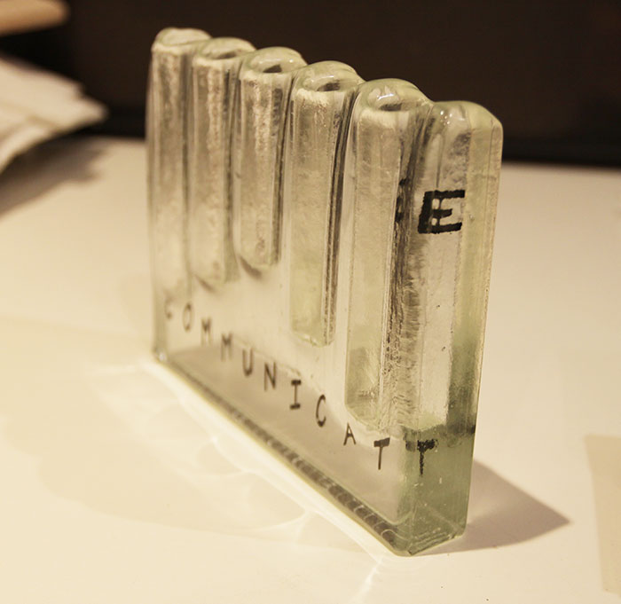
Jumping e

The bitter irony was not lost on me that while I was being all sanctimonious about the students not paying enough attention to detail, I had not noticed the most basic of errors in my own work… the word ‘Communicate’ looked like the “e” was making a bid for freedom!! Stupidly I had put the “e” in upside down so it appeared at the top of the piece, not the bottom. How had I not spotted this before it went in the kiln?! After the swearing had subsided, I reflected that this was probably karma biting me back for being so unforgiving when judging the student work.

I did not have time to make another one. Last week, the first version looked perfectly acceptable, albeit too big for the packaging, but now, having been offered the extended deadline, I had come to view the older version with disdain, knowing that I had time to make a truly perfect version. And yet my new version now looked ridiculous!

Should I submit it anyway, allowing people to think the jumping “e” was intentional? Should I submit it in its perfect giftbox with a shameful note of explanation? Or should I settle for the old version, which now looked so clumsy to my perfectionist’s eye, sitting awkwardly in its box?

As I went to bed that night I thought about my experience as a judge on Monday and I realised, with a leap of perception, that I am actually far more critical and less forgiving of my own work than I am when looking at other people’s work. I reminded myself that although I was complaining about the students’ scrappiness in the written presentation of their ideas, I was very much more generous and open-minded when looking at their actual glasswork.

I slept on my decision. The next morning I awoke with a compromise solution. To my eye the original set of samples would now never seem perfect, but to anyone else’s eye they would be fine. And the packaging problem? I did the unthinkable, and abandonned the idea of using my giftbox altogether…. for someone like me who produces fairly commercial products this was a bit horrifying as it meant losing my branding. But within an hour I had googled a great company who make drawstring pouches out of jute, and suddenly I had a solution, albeit a very longwinded one as it involved me driving to the other side of London and then a long detour back via Art Logistics in west London to drop off the finished pieces. All that driving gave me time to reflect that the extended deadline had been a gift, but it had also resulted in me being subject to the curse of my own perfectionism.
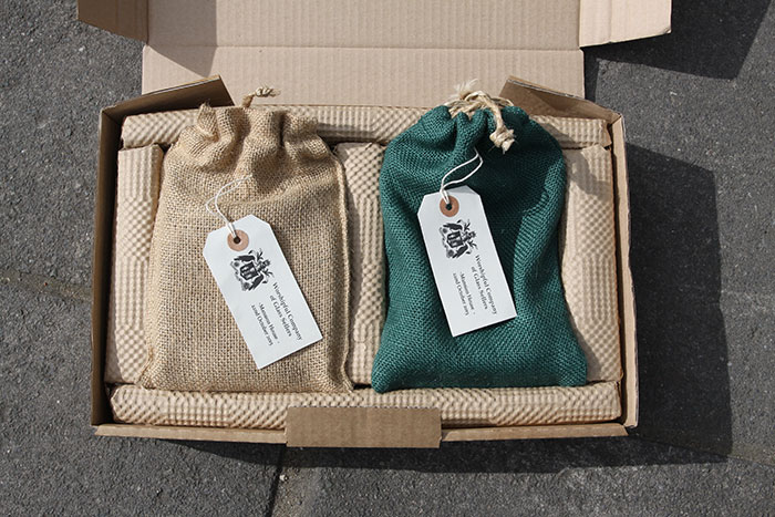
Finished and packagedOne day I will achieve it, but for now I can but dream of the day when I can think my way to an acceptable compromise without needing the pressure of a deadline!