Dismantled Panel

I’ve got two stained glass panels from the new house to renovate. They are potentially beautiful Victorian windows with some pretty painted sections, but various things have ruined them.

Stained Glass panels


Firstly there are lots of breakages all over the place and some bright spark has used araldite to glue completely different pieces of glass over the cracks. Secondly there are some odd discrepancies, like painted pieces which don’t match in colour or style or positioning, or painted pieces that were clearly made for other areas of the panel and then repurposed. This hotchpotch may have been done by the original Victorian artist using old scraps of glass, but I suspect these panels have been rehashed since then as there is also glass in there that does not look Victorian to me. Thirdly the colour balance has been so messed around with that it’s actually difficult to see the original scheme. Annoyingly it appears that the remedial work done to it was so unprofessional that the results are worse than the original problem… this is beginning to sound much like our house itself, the building from which they were taken out.

Once they were removed from the building I looked at the state of the lead to see if I could work with it, but it was so battered up I decided to dismantle the panel completely and start again with just the original glass.

This film shows the first stage of remaking one of these panels in which the lead lines are traced before the panel is dismantled. I’m working super slow these days given that everything is done during baby naps, so it felt good to use the magic of technology to speed everything back up to my pre-baby levels of efficiency!

Love, Requited

Wedding Venue

A couple of years ago I made four panels to hang at my wedding. They spelt the word LOVE, which was obviously intended for its romantic setting.

Wedding Panels

However there was another context for the panels as they were going to be delivered straight from the wedding venue to a show at the William de Morgan Centre in Wandsworth Museum and the backgrounds to the lettering were all taken from patterns on various de Morgan ceramic pieces.

William De Morgan ceramics

William De Morgan was a contemporary of William Morris and collaborated with him for many years, and both were advocates of the famous line Morris wrote for an 1880 lecture on ‘The Beauty of Life’ for the Birmingham Society of Arts and School of Design: “If you want a golden rule that will fit everybody, this is it: Have nothing in your houses that you do not know to be useful or believe to be beautiful.”

I have always been inspired by the Arts and Crafts movement, and the way in which its proponents seemed to successfully turn something they loved into an industry. Five years ago I named my debut solo exhibition at the Menier Gallery “Work and Love” with exactly this idea in mind. So it seemed fitting to me to draw inspiration from the Arts and Crafts designs to illustrate the word “Love” in my wedding panels.

My Love panels have been displayed in various ways since, but I had always intended to turn them into lightboxes for display on a wall. This year I mounted them on the wall of my stairwell for my Open House and a local couple rather fell in love with them and wanted to buy them for their own house. The frames were painted a Liberty-style purple but I had the frames specially lacquered to the exact mauve that they required to fit into their home decor. We had discussions about how they might be turned into lightboxes but, having trained as an engineer, the husband took it on as his own project to arrange.

Love Wall

It was wonderful to be able to drop off the panels, and come back a few weeks later to see all the technical and practical complications of installing lightboxes had already been done!

Butterfly wall

It was also rather lovely to see that the clients had amassed a collection of wall butterflies from me which complemented the glass on the other side of the room.

Dappy’s conclusion

I had a week between my West Dean show and the end of the school term to create the eight glass panels that I was making for DUCKs as the conclusion to my school commission. The panels illustrated eight scenes from my story of Dappy the Duck and each panel was 50x50cm with kiln formed glass images and screenprinted text, so there was a lot of glass to make! Working late into the night every evening was the only way I was going to get it done and I pretty much squeezed two weeks’ work into one week. There was the slight disaster where one of my panels slid into two others in the kiln, but two out of the three panels could be salvaged and, though I needed the extra weekend to remake the unsalvageable piece, I just about made the deadline of the final assembly of the year on Monday morning to present the eight panels to the school.


The panels were hinged together in two sets of four so that they formed a kind of summary of the story. To fill in all the gaps, I also provided the school with the storybook itself, illustrated and printed out so that future classes could read the story and link it to the glass panels.

Ducks panels installed
A few days later after the end of the term, I came back to help install the eight panels in the foyer of the school. The panels were hung low on the wall, and when the children return in September next academic year they will be encouraged to touch the tactile surfaces of the glass. Also on display in the foyer will be the finished model of Dappy the Duck, which was made in collaboration with the children in the accompanying school workshop sessions.

Dappy the Duck

It was an exhausting couple of weeks but very enjoyable to be working with such brilliant children. Who’d have thought a bunch of four year olds could paint a model so beautifully?! Thanks to Jo Parker who instigated and arranged the project as well as the installation of the final work, Helen Dolby who coordinated the parents’ fundraising to provide the budget for the project and Heather Friell, the outgoing headmistress under whose directorship the project was possible.

My Youngest Clients

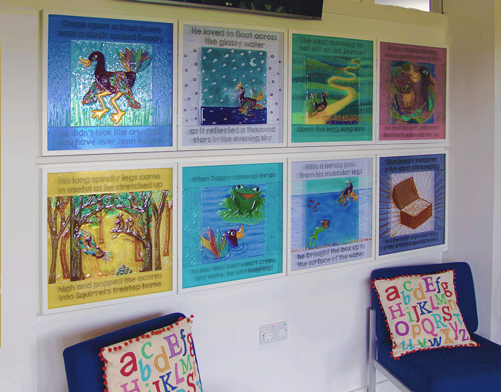
I’ve worked on primary school projects before but never have I been asked to work with pre-school children. My latest school project was at DUCKs, the kindergarten and infants school for Dulwich College. The school’s fundraising had given me a budget with which I was asked to devise a set of art workshops for all the children and then create some kind of final piece for the foyer. The children range from 3 years old up to 7 so I was a little tentative about how to incorporate glass into this school project.

DUCKs

In the end I decided that as children of all ages respond to storytelling I would base the art workshops around the building of props to illustrate and bring to life a story. I toyed with the idea of getting the children to help me write the story but in the end, because of time constraints and the very tight schedule of work that I had to fit in to the last two weeks of term, I realised I would have to come with a ready made story. With an obvious theme dictated by the acronymic name of the school, I wrote a special story about Dappy the Duck.

I had some misgivings about using the name ‘Dappy’ because of the idiot pop star who goes by the same moniker, but I liked the fact that the name conflated the words “Duck”and “Happy”, but with a little sense of silliness about it too, which reflected my title character. I consulted a few teachers about my worries, but luckily the demographic of my audience was either too young or too old to have heard of the NDubs fool, so I was in the clear!


The story sends Dappy the Duck on a journey to follow a trail of clues left by his grandmother to find his inheritance, a treasure chest full of glassy gems. On the way he meets a kitten, a squirrel and a toad, and he learns three life lessons which reveal him to be kind, helpful and happy to his new friends. I devised eight art workshops to match each class to one chapter of the book.


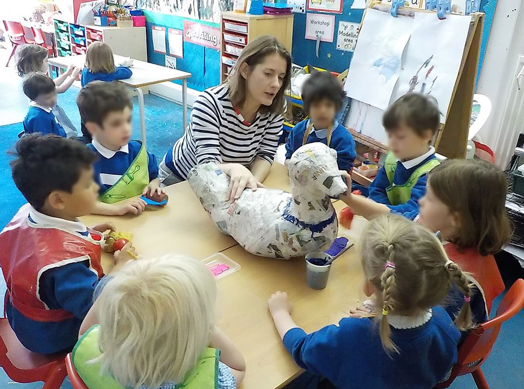
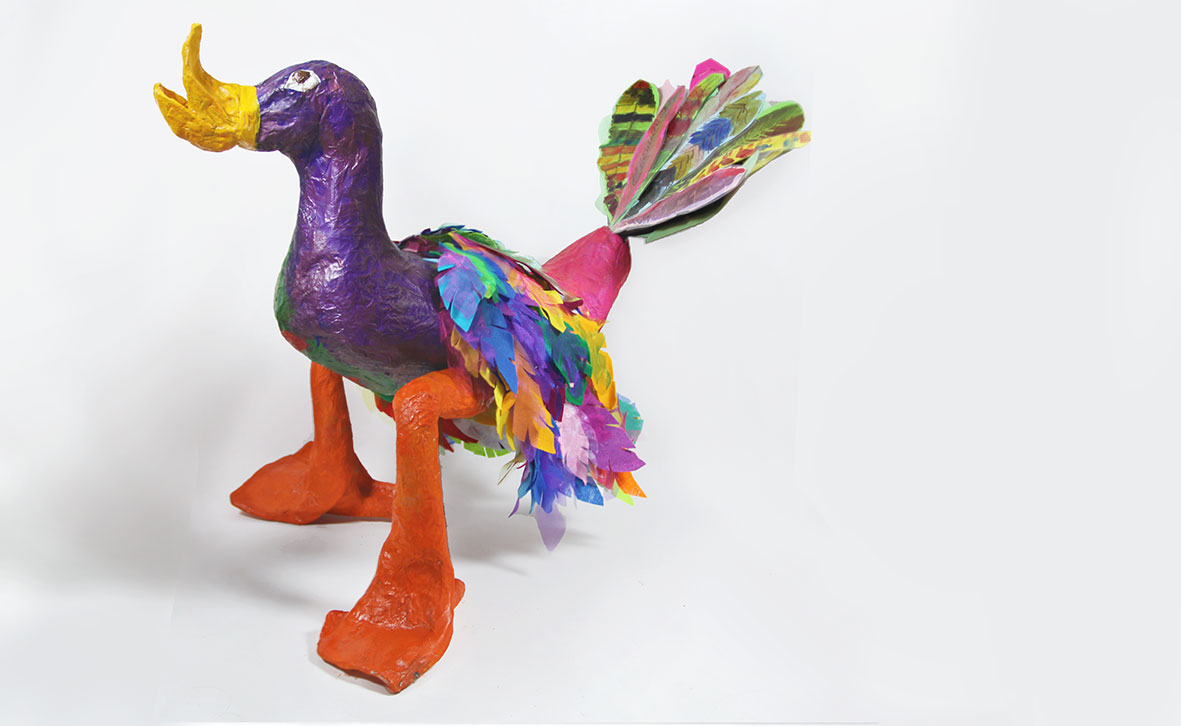
Some of the art activities centred around decorating a model of Dappy the Duck, and an added complication was that it had to be detachable so that the various body parts could be separated for different groups of children to paint. I spent an evening making the basic model out of chickenwire with screw in legs made from a couple of bottles and feet made from parts from two old mops. It was all rather Blue Peter, but once it was covered in papier mache it began to take shape!

2-story-telling

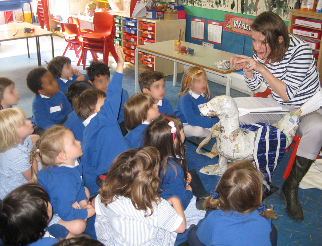
The papier mache Dappy accompanied me to every workshop and, even in his unfinished state, he was a useful prop for telling the story!

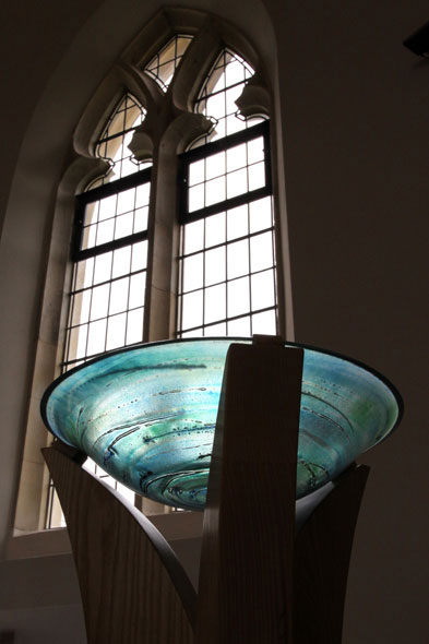
Each session lasted an hour, with my initial introduction showing the children one of my bowls and talking about the special qualities of glass. All the children loved touching the bowl, but it was really satisfying to me that the eldest children were also really interested in the technical aspects of kiln formed glass and asked some really incisive questions. Then, after hearing the story, the children participated in a half hour artmaking session which related to one of the eight chapters of the story.


Dappy developed from session to session. The youngest children helped to paint the model duck, and made feathers for the wings and tail and one workshop was based around making him a nest. With the older children I could explore the themes of the story in a more nuanced way, so the last two workshop sessions related to thinking about the qualities of a good friend, and how to be kind, helpful and happy.

Painting the Duck


No matter the age of the children, I discovered that one of their favourite bits of the story was hearing the clues that Grandma had left for Dappy, so it was just as well that one of my last minute ideas was to have a child untie a ribbon on a paper scroll and (the older children) read the clue to everyone. Remembering back to my son’s early birthday parties I knew that a treasure hunt would go down well, and it would allow me to tie in the experience back to the glass theme, so the last part of each session was for the children to participate in a three-clue treasure hunt themselves around the playground. Each group found a box of “treasure” which was actually lots of kiln formed glass pieces. It was sometimes difficult to keep their excitement under control at their being allowed to pick a piece of treasure to keep and take it home!


It was with some horror when I heard later from a parent that one of the children had loved his treasure so much he wouldn’t let it out of his sight… the inevitable conclusion being that it ended up being swallowed!! I thought I had made the glass pieces more than large enough to avoid this occurrence, but apparently not too big for this committed treasure-hunter! Luckily the parent involved was very cool about it and only felt awkward about having to describe to her child what would happen to the glass post-ingestion!

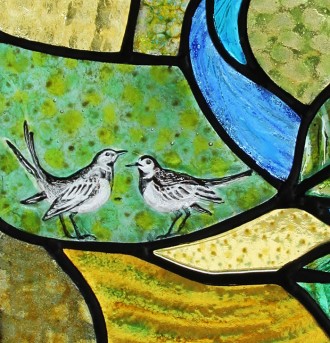
To see the final glass panels I made for this project click here.

Built from Scratch

On the Bank Holiday, I had to make an unexpected trip down to West Sussex to deliver work. Strangely, two days earlier my mobile phone had gone crazy and was inexplicably sending texts to a client of mine instead of the friend with whom I was trying to arrange my Friday night plans, but it was timely as my client mentioned that the windows I made for him last year had finally been installed. This gave me a second reason to go down to West Sussex, so I jumped in the car and made it down in record time.

I was delighted to see the almost completely finished house, a magnificent building which the clients had designed and built from scratch on a lovely site near the Cowdray Estate. My windows were designed for the porch so they were the last things to go in, to avoid any builders’ accidents going in and out of the building.

I brought my camera to capture the windows in situ and I was glad to see that the light was balanced well and the panels looked bright and colourful even on this slightly overcast day. The porch acted a little like a lightbox with the light coming through the glass into the darker space within, and with a strong light inside the porch the windows will look lovely from the outside at nighttime. The constant frustration for us glass artists is that our panels can’t simultaneously look good from inside and outside but, such is the nature of the material as it always looks its best viewed from the dark side with the light flooding through.

However with the panels illuminated, lots of detail could be seen up close and these panels were designed to reward closer looking. The clients have an affinity with racehorses and wanted references for this to be subtly included in the panels, as well as a couple of wagtails, one of which had flown into the outbuilding while it was being constructed. The features in each of the panels were inspired by the topology of the surrounding area, so as visitors come in through the porch they will see echoes of the land behind the house. The clients have always owned cats, and so I included a hidden cat in the ‘Water’ panel – I had assumed visitors would spot it fairly quickly but apparently it consistently evades identification. Can you see it?!

Read about the making of the panels here.

Aside

Sad face

An update on my shortlisted proposal for the art commission at Abingdon School… well, my proposal was submitted, my designs developed and numerous conversations with various studios helped me to flesh out my ideas. I spent four hours last Friday driving to my interview, including a very tense hour spent in standstill traffic outside Oxford wondering how late it was going to make me! And after my interview, I felt fairly confident that I’d got my ideas across to the panel of six representatives from the school.

However I had my hesitations and I didn’t want to go full steam ahead without raising the prospect of the challenge that I faced in getting the budget to work. In the end, I think this may have raised doubts as the commission was being managed on a tight schedule, and I was told this week that I didn’t make it through to the next stage.

Design for Abingdon School

It’s a real shame, as I think the glass would have looked spectacular. Ironically it wasn’t the glass that was causing such an issue with the budget, but the supporting structure. A pair of stainless steel beams to hold the glass panel would have taken 40% of the budget, and this was the simplest solution. I was looking into alternative methods of supporting the 600 kg of glass in the 10 metre high glass wall that I was proposing, despite the fact that the roof was not to be load bearing, and I may well have come up with an innovative solution that could have cost less but, alas, time was running out. However the design of the glass itself presented no such challenges and I had an immediate image in my head as soon as I read the brief. The artwork was to be installed in the new Science Centre, within the main staircase, and it was intended to represent the three sciences that were located on each floor. My concept was based around the way that I feel boys learn (Abingdon is a boys’ school) and, with a sixteen year old son who’s just finished his GCSEs, this is a pretty pertinent subject matter for me.

Boys’ learning seems to me to me much less consistent than that of girls. Boys seem to spend a lot of time absorbing much teaching without apparently learning much! Then somehow a teacher or parent says something in the right way and that acts as a key that opens a door of learning and suddenly they make great strides forward. So my artwork is a trail of iconography representing the curriculum across the seven years for each of the three sciences. But every so often one of these images is picked out in golden hues to symbolise the metaphorical door to learning being opened. The history of Abingdon School has a strong association with the number 63, and my artwork represented this numerically with an image symbolising each of the three terms of the year, for each of the seven years a boy will be at the school and for each of the three sciences which adds up to 63 images in the artwork.

Glass Proposal for Abingdon School

It’s really a pity that they didn’t go for it, but I’ll be following future developments on the commission with interest.

Aside

A Weighty Proposal

I’m really delighted today to have received an email telling me that I have been shortlisted for a really exciting commission.

The commission is for an artwork to be installed in the entrance to a new science centre at a school outside Oxford. The building is currently in the construction phase and is due to be completed next year. The artwork would be placed within the three storey main staircase, visible from the outside through the glass fronted building.

Science-Centre
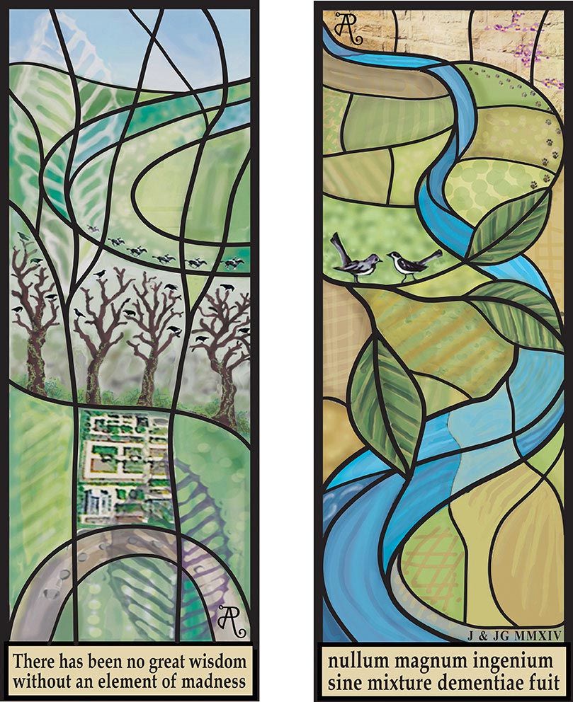
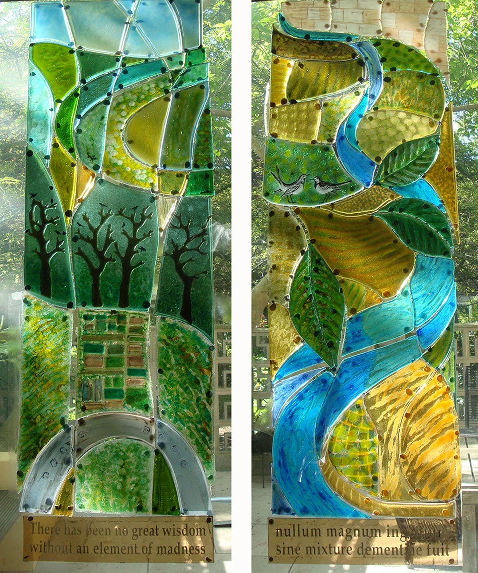
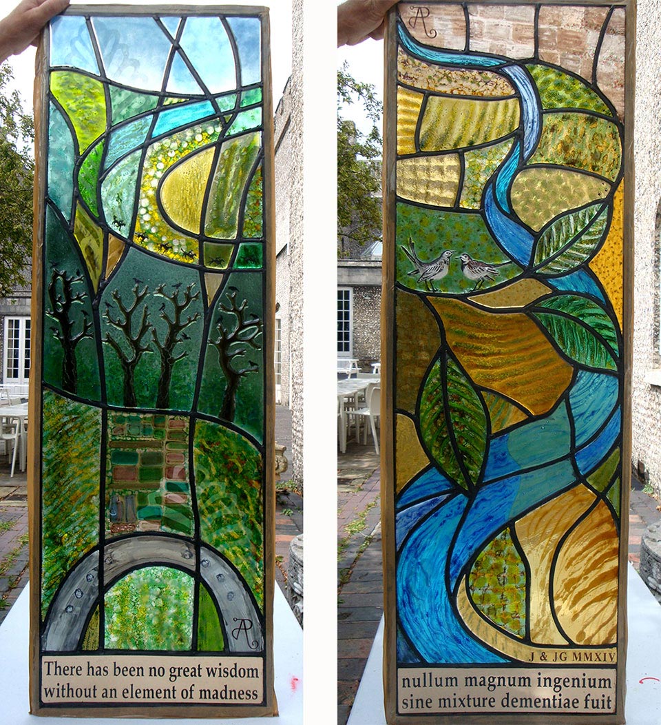
I have got through the first stage of the application process with a proposal that took me quite a while to prepare. Amazingly the concept for this artwork came to me almost instantaneously upon reading the brief. It has only ever happened once before where I have a complete image in my head of the final piece, without drawing or sketching to develop the concept.

The problem was then to actually get it down on paper, and as I worked on the sketches for submission, the days seemed to evaporate. Finally the deadline day arrived and my proposal was ready but I was slightly shocked to see the size of the digital submission…. 122MB of data was finally uploaded to Dropbox, with a note of apology! My computer was creaking under the weight of it!

Anyway, the selection committee must have been able to open it, as my proposal was put forward as one of 5 from the original group of 64 artists who applied. I will have an interview in a couple of weeks to further lay out my ideas, so it’s back to the old drawing board for some R&D.

Land and Water in West Sussex

I’ve been working on a commission for the last few weeks which has been delivered but not yet installed. I gave a talk over my Summer School course at West Dean College on the making of the two glass panels for this commission so I have photographs of the making process. These panels will be installed into the porch of a house which is currently being built in West Sussex, and they are leaded panels but using thick textured kiln formed glass which will really hold and bounce the light around the patterned surfaces. My clients showed me images of traditional glass windows that they liked so I had an idea of their taste, and they were keen that the panels would include references to the local river, the sandstone in the village houses, local wildlife and the clients’ connection with cats and horses.

designs

After a few weeks of design development they agreed on my designs (above) which included an inscription in English and Latin, their initials and my monogram. The ‘Land’ panel on the left included a depiction of the row of sweet chestnuts behind their house and their kitchen garden as seen from above as well as the racing horses and a horseshoe to imbue the new house with luck. The ‘Water’ panel on the right includes the river flowing past the sandstone walls of the village, a pair of wagtails, and a hidden cat watching the birds, as well as its paw prints following the line of the wall.

Samples were sent (above left) to show the colours and level of texture of each piece in the designs. Once approved, the glass was cut to a full size cartoon. Every part of the panel was made with two layers of glass and its textural qualities were achieved in the kiln using a variety of techniques. Sometimes the texture was on the back surface, but most was on the front where it would be able to be touched once in situ.

Glass-before-leading

Once each piece had been formed in the kiln to get the right colour and textural qualities, I used blue tac to stick them up against my studio windows to get an overall impression with light coming through. Part of the glass artist’s challenge is to envision the whole image as it will be seen in situ. The light can change a composition dramatically with colours or textures reacting in various ways to the differing quality of light coming through the glass. However at this stage the clients were happy and I could see that although some pieces needed tweaking, the overall effect was good.

So the final stage was adding detail either with fusing, or with sandblasting (above left) or screenprinting (above right) and firing at a lower temperature to fix these details. Once all the glass had gone through the kiln for the final time, I used a grinder to get the exact fit between the pieces. This wouldn’t normally be needed with traditional painted glass, but when working with kiln formed glass which is 6mm thick and can get misshapen in the kiln, there is often some fine fitting work to be done which can take a while. Finally the glass is all leaded together using traditional tools, and the joints soldered so that the whole puzzle one has just created holds together. Cement is applied in all the gaps to give the panel strength and durability and then comes the unenviable task of polishing and cleaning the lead and glass….  not an easy job when the glass is pitted and textured. However it is always worth spending a bit of time on the final clean to really get it all pristine and to maximise the contrasts between the coloured glass and the dark lead lines.

final panels

The final pieces were taped up against a background of laminated glass so that I could get a quick snap of them before they were delivered to the site. Proper photos will be taken once the panels are installed.


Gallery

Central Saint Martins job

Zusana Gombosova's piece

I recently did a job for a Central Saint Martins student to custom make some glass for her MA project. Zuzana Gombosova has built a research device for growing objects from Bacterial Cellulose. This device could enable its user to grow and engineer properties of the material, eventually growing it into small complex objects. Her work is on show from 18-24 June at the new CSM building at 1 Granary Square, King’s Cross.

I made seven panes of glass with a smoky graduated tone for her structure. The graduation of tone was achieved with the very careful application of glass enamels by airbrush spraying. It was a frustrating process as the slightest droplet or scratch would show up on the layers of spray, so it was a matter of cleaning off and starting again (many times!) until I had eventually an absolutely perfect graduation. Then I had the seemingly simple job of matching the graduations between panels which, again, was not simple!

Zusana Gombosova's piece open

Video

Praise Be!

StNicholas Font

I got the tip off that my work had briefly featured in Songs of Praise. This episode, Phoenix from the Ashes, partly focused on St Nicholas Church in Radford Semele which was rebuilt after being almost razed to the ground in an arson attack. The programme makers interviewed Emma Blount who made the beautiful leaded glass windows, but there was some brief footage of the glass font bowl that I made.

The section of the programme about St Nicholas Church starts from 6:30 and my glass appears briefly at 8:12 and 8:45