The Final Judgement

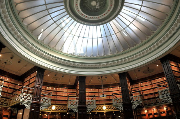
The Stevens Competition prizegiving day was on Tuesday and though we were one judge down, we had a lively seminar between Helen Whittaker, Douglas Hogg and myself, the three judges that were left. The seminar is traditionally held at the magnificent Glaziers Hall on the river at London Bridge, where the competition entries are spread around the River Room for students and visitors to look at before a group discussion. With fewer entries this year than in previous years, we were able to lean all the entries against the windows with a wonderful vista across the River Thames, and it was lovely to see all of them at once, as opposed to the judging day when we were shown the panels in groups of six.

Just before the students came in, we three judges had a conflab and decided that the chairs were too widely spread to create a sense of intimacy in the ensuing discussions, so we rolled our sleeves up and tottered here and there moving the furniture around in our high heels (Helen and I, that is – Douglas had chosen more sensible footwear!).

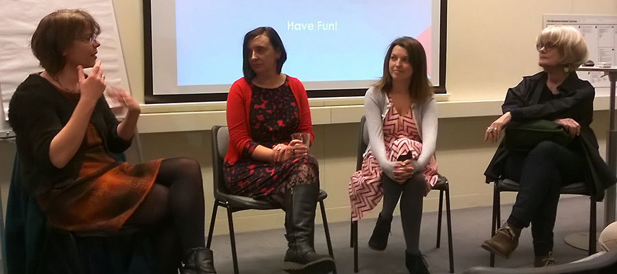
And then it was time for the students to enter to hear our verdicts and our feedback on each of the panels on show. I found my outlook subtly shifting gear from the critical judging eye that we had employed when filling out the mark sheets for each panel, to the softer, more educational stance we needed to take in order to deliver our feedback to the artists. Helen voiced my own feeling that at times like this, we feel we are no more qualified than anyone else to proclaim which panels are good or bad; certainly for my part, it feels like not long ago that I was one of the students waiting to make sense of the feedback delivered about my own efforts in the Stevens Competition. However we were brought into do a job and, on the whole, we largely agreed about the general verdict on most panels.

It was lovely to hear the students themselves explain their own motivations for the designs and to see the genuine pride in the faces of the winners. However a downside was hearing from one student who came up to me after the seminar and said she felt she had failed because the sum of her marks in the various judging categories added up to less than 50% of the total available marks. She felt dejected and expressed doubts that she’d want to enter the competition again. I tried my best to assure her that the marking system was not necessarily a reflection of the quality of her panel, but I suspect she thought I was just back-pedalling. I have thought about this more since that day, and I stand by what I was trying to explain to her. When marking panels which are set against each other in a competition, one marks differently from how one would assess a panel on its own merits. It is the difference between the judging eye and the educational stance, that I was alluding to earlier. When one is marking to judge, one has to ensure the aggregate marks are differentiated from panel to panel…. in other words, one starts by imagining the panels in order of strength in each criterion and one mentally gives, say, the eleventh panel out of the sequence of twenty one a mark at roughly 50%. Then the ten stronger panels in the imaginary sequence would be graded above 50% and the ten weaker panels would be graded below. That is not to say that the eleventh panel is only half as good as it could have been but, for the judging process, the difference between the marks aggregated by each panel is more important than the marks themselves.

Unfortunately the girl I spoke to didn’t understand that this was what the marks represented and took her below 50% mark to be a damning indictment of her work. It was a great shame because her work had a lot of excellent qualities, but in this case they were just not quite right for this commission for Swansea University. As I said to her, if the commission that has been discussed by the Glaziers as a possible candidate for next year’s competition goes ahead, then I would anticipate her particular style would be very well suited to that competition, and I hope that she reconsiders applying again.

The Artist is in Residence

I am in the unfortunate position of having every single member of my family – both parents, my sister, my husband and my son, as well as a good friend – celebrate their birthdays in the month around my annual Open House. It always makes life impossibly busy in April and May, both workwise and socially, as one birthday after another is celebrated.

However I reckoned by the end of April, when my other half turns a year older, I’d be a bit fed up with nonstop work, so I decided to give us both a couple of days off in celebration and I booked a little break in a boutique hotel. We packed our bags and headed off to central London with the Artist Residence hotel in Pimlico our destination.

We strolled down from Victoria station feeling distinctly like tourists in our own city, and as we approached the building we were marvelling at the mammoth first floor windows in the Victorian building. The reception gave a flavour of the hotel’s characterful decor – a heady mix of reclaimed rustic furniture, luxury Victoriana inspired fixtures and modern graphic artworks. We were delighted to discover that we had been upgraded to the Grand Suite, the room which boasted the three enormous windows, and the eclectic urban rustic theme continued in here with a wonderful open plan room with a magnificent claw footed bath.

We drank champagne from the hotel beakers, ate cupcakes and I had the most indulgent 4pm bubble bath looking out onto the streets of Pimlico below.

I had planned to take my man out to a private view of my friend Eryka Isaak at the Skylark Gallery near the Oxo Tower that evening and then dinner at the Mondrian Hotel next door, so I thought it would be rather stylish to travel down river Bond-style in a boat from Millbank and alight at Blackfriars Bridge. I had left us plenty of time to get to the pier, but somehow my efforts to dress up in heels and a nice frock was our undoing. Between being a bit drunk from the champagne and trying to manage the verging-on-obscene thigh-high split in my dress, I got flustered and took us to the wrong bridge, resulting in is missing the last boat of the evening. So after a frankly annoyingly long walk in high heels, we arrived at the gallery flustered for Eryka’s private view and late for supper. James Bond would have managed that journey with more panache!

However the walk afforded me a few lovely photo opportunities for what was a stunning sky in perfect evening light. And after a lovely meal at the Mondrian we took a cab back along the river to our fabulous hotel.

The next morning we took a stroll to Chelsea Farmers Market for brunch. I lived in Chelsea for about 15 years but I haven’t often been back since and so it was a bit of a walk down memory lane as well as a lovely urban ramble through the back streets of Chelsea, past the wonderful wisteria clad entrances to the grand houses of Cheyne Walk and back to Pimlico along the river.

A Gift and a Curse

My last blogpost expressed my frustration at the lack of polish in the students’ presentation of their competition proposals. While I was away from the studio last Monday judging the Stevens Competition, my little kiln was busy firing my own glass samples for a competition. The theme of the competition was Innovate | Communicate and entrants were asked to make a pair of favours for a Banquet at Mansion House (see all the competition entries here).

Design for penholder
I had considered the theme and I wanted to make something which could be kept on a desk – the place where most designers, thinkers, writers and business people communicate and innovate – so I designed a cast and slumped matching pair of curving glass pieces which were to function as contemporary desk holders for pens. The words “Innovate” and “Communicate” were printed within each respective pen holder. I had spent a long time making little samples trying to work out the correct sizing to fit even the biggest fountain pen and I finally made a finished version which looked good and felt stable.

However when I went to package it in my signature giftbox, I realised I’d miscalculated something as it was still slightly too big to sit comfortably in the box. I was running out of time before the deadline – cast pieces always take forever in the kiln – and my brain went into overdrive to come up with clever ways to support the glass in the giftbox at an angle which just allowed it to fit.

Then a wonderful email arrived in my inbox from the organiser of the competition saying that she was extending the deadline by a week. What a lovely surprise! I had plenty of time to make another pair at the perfect – slightly smaller – size. With the luxury of time on my side, I could even tweak and perfect the making technique.

So when I chatted to John Reyntiens on Monday – one of my fellow judges who also happened to be entering the competition – I was confident of easily making the extended deadline of Friday. And yet, later that week when I opened up the kiln to inspect my perfected pieces, my heart dropped through the floor and the cursing that was to be heard would have made any West Dulwich resident blush….. I had made a stupid, stupid error!

Jumping e

The bitter irony was not lost on me that while I was being all sanctimonious about the students not paying enough attention to detail, I had not noticed the most basic of errors in my own work… the word ‘Communicate’ looked like the “e” was making a bid for freedom!! Stupidly I had put the “e” in upside down so it appeared at the top of the piece, not the bottom. How had I not spotted this before it went in the kiln?! After the swearing had subsided, I reflected that this was probably karma biting me back for being so unforgiving when judging the student work.

I did not have time to make another one. Last week, the first version looked perfectly acceptable, albeit too big for the packaging, but now, having been offered the extended deadline, I had come to view the older version with disdain, knowing that I had time to make a truly perfect version. And yet my new version now looked ridiculous!

Should I submit it anyway, allowing people to think the jumping “e” was intentional? Should I submit it in its perfect giftbox with a shameful note of explanation? Or should I settle for the old version, which now looked so clumsy to my perfectionist’s eye, sitting awkwardly in its box?

As I went to bed that night I thought about my experience as a judge on Monday and I realised, with a leap of perception, that I am actually far more critical and less forgiving of my own work than I am when looking at other people’s work. I reminded myself that although I was complaining about the students’ scrappiness in the written presentation of their ideas, I was very much more generous and open-minded when looking at their actual glasswork.

I slept on my decision. The next morning I awoke with a compromise solution. To my eye the original set of samples would now never seem perfect, but to anyone else’s eye they would be fine. And the packaging problem? I did the unthinkable, and abandonned the idea of using my giftbox altogether…. for someone like me who produces fairly commercial products this was a bit horrifying as it meant losing my branding. But within an hour I had googled a great company who make drawstring pouches out of jute, and suddenly I had a solution, albeit a very longwinded one as it involved me driving to the other side of London and then a long detour back via Art Logistics in west London to drop off the finished pieces. All that driving gave me time to reflect that the extended deadline had been a gift, but it had also resulted in me being subject to the curse of my own perfectionism.

Finished and packaged
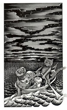
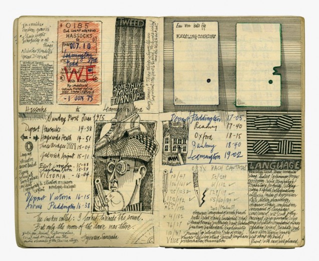
One day I will achieve it, but for now I can but dream of the day when I can think my way to an acceptable compromise without needing the pressure of a deadline!
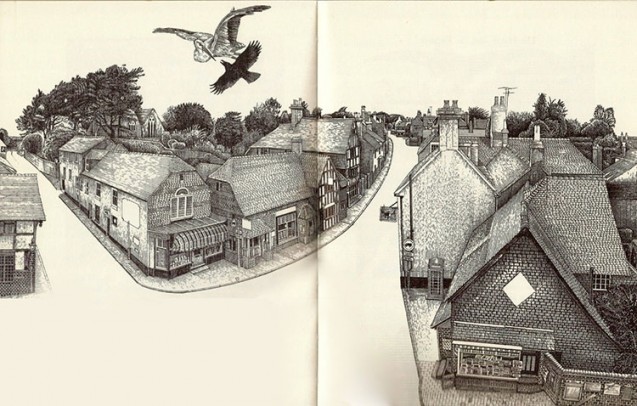
Competitive Spirit

I took the train up to London Bridge on a lovely sunny Monday morning this week to do my judging duties for the Stevens Competition. Glaziers Hall was unavailable so we had a lovely room in Southwark Cathedral Conference Centre with lots of windows to view the sample glass panels. Ironically the site where the finalist’s panels are to be installed is in a corridor with substantially less light, so this was a critical consideration from the beginning.

However as a first time judge, I had a lot of other criteria to get my head round before anything else. The four judges were given a short introduction and then we worked in half hour segments, viewing and marking 6 panels at a time. There were six criteria to assess each panel against, but before I got down to the sticky business of handing out marks or reading artists’ statements, I wanted to give each panel at least a few minutes of my undivided attention. It doesn’t seem so long ago that I was entering the Stevens Competition as a student, and I remember how much thought and effort and work went into my entries, so I really wanted to just appreciate the glass pieces on display and connect on a sensory level with the artist’s intention.

Little did I know how much time would elapse while I was being all touchy-feely and when we were given our ten minute notice, I was in a slight panic noticing that the other judges had already allotted their marks and I hadn’t even started! Needless to say I managed my time a little better with each subsequent group of entries, so by the end I had the timing down to a tee.

We judges struggled with the decision beyond the first round of judging. We were to choose a prize for craftmanship and for presentation and the debate that ensued assured me that the Glaziers Guild, who run the competition, had chosen the group of judges well – we all brought different skills and areas of interest to the table, and we had a lively discussion for both categories.

After lunch, we proceeded to the second stage of judging which had a selection of the twelve strongest panels, again shown in two groups of six. This time we discussed each panel before remarking against the same criteria, and although I am pretty sure that my marking was consistent and a second viewing merely strengthened my convictions about most of the panels, we were told that overall our second round marks showed quite some variation to the first round marking…. the group discussions had obviously engendered a lot of thought.

What was interesting was how some panels which had seemed very strong contenders to start with, did not hold the emotional connection upon further scrutiny, whereas other panels which seemed obvious on first viewing, somehow acquired more depth the longer we considered them. Inevitably at this stage we were beginning to think about the panels in situ in a long, busy corridor and these aspects started to come into play in our decision-making. The final decision was deliberated upon for quite some time, going back and forth between pairs of panels, comparing them against each other to see how they fared when either viewed up close or at a distance.

The final marks were totted up and announced to us and, despite the worry that sometimes intricate marking systems can skew the results and favour submissions that don’t inspire that gut-feeling ‘rightness’, we were all satisfied that the marking had produced the right overall decision. It was a learning curve for me for my own practice to realise that the order of importance in submitting a competition proposal is to communicate:

1. simply
2. efficiently
3. professionally
4. emotionally
5. deeply

These are the chronological stages one goes through as a judge from first viewing to decision-making, though interestingly this does not match the chronology of viewing an artwork as a spectator, for which an emotional link with the artwork is of primary importance. However, as judges, we had to consider that the final panel chosen will be made and installed in an actual site (Swansea School of Glass), and thus it was critical that we had confidence in the winner’s professionalism as well as integrity of their work.

This was one thing on which I felt many of the entries fell down. I am a terrible perfectionist so I was aware that I was applying my own high standards and expectations to a group of student work, but I left feeling rather peeved that the easiest part (by a long way) of assembling a complete competition submission – such as checking for spelling mistakes or mounting a printed piece of paper on backing card rather than shoving in a dog-eared printout – were not done. I know one is meant to look past these things, but it immediately undermines one’s confidence that the entrant will have attention to detail in the final installation if the most basic of tweaks are not made in the submission in the first place.

However this aspect will provoke a lot of discussion at the prizegiving in May when the prizewinning students are announced. It will serve well as an educational experience for those that didn’t quite make the grade this time to improve for the next time they enter a competition such as this.

Happy Easter!

Easter Eggs

Happy Easter everyone! One of my resolutions this year was to try and get back to enjoying making instead of it becoming another thing on the to-do list…. finding my creativity again and rediscovering my childhood joy in the act of making.

I am the daughter of a German mother and I am the mother of a Russian Orthodox son, so I connect with Easter as a time of making, even more than Christmas. I loved the Germanic tradition of painting eggs which I remember doing as a child with my mum and my aunt. The Russian Orthodox tradition of staining eggs with a red dye was something from my son’s childhood and I have always had a bit of an obsession for Russian Orthodox iconography. So I thought I’d make my own version of Fabergé’s bejewelled eggs to celebrate Easter.

Drawn to Drawing and Ditchling

I met up this evening with the aptly named Sussex Sketchers, a drawing group brought together loosely from a pool of talented creative women. Unfortunately being in London, I am perhaps the one who has to travel furthest to meet the others in Sussex or Surrey, but it has proved worth the journey every time. So when it was suggested that our latest meeting should be at an evening lecture in Ditchling Museum of Arts and Crafts in East Sussex I didn’t hesitate!

I had not been to Ditchling before and, arriving at sunset, I drove around a little to find the museum. As I walked across the green to meet my fellow sketchers for supper at the White Horse, I saw the beautifully lettered sign for the museum and took a photograph. This was a little clue as to the history of Ditchling. The title on the sign was picked out carefully in Gill Sans, the typeface designed by the sculptor and Arts and Crafts figure Eric Gill who lived in the village for almost two decades and set up an Arts and Crafts community there which remained long after he left in 1924.

The lecture was given by Ditchling resident John Vernon Lord, whose name rang a bell but I couldn’t quite place until I saw his fabulous drawings. He has illustrated many children’s classics as well as writing and illustrating his own books, including The Giant Jam Sandwich. I have been thinking a lot recently storybook imagery from my childhood, and these pictures felt familiar and nostalgic and, published in 1970 as they were, I wondered if I might have seen this story at school.

As he spoke on, showing some of the thousands of drawings he has made over his 40 year career, the penny dropped… he illustrated The Nonsense Verse of Edward Lear (above left) which we had at home when I was a kid. I knew I had seen his drawings before!  He described in detail how many of his illustrations incorporated houses and roads from Ditchling, as well as being full of hidden references and personal mementos. One of his pictures displayed two perfectly rendered keys which he had drawn from his real life house and studio keys. When he locked himself out one day he managed to get a keysmith to make workable duplicates from the details in the drawing!

Time was beginning to run short so he sped through what I thought were the most beautiful images of all – the sketches he had made in his little notebook. Wonderful, carefully draughted sketches covered every double page spread accompanied by notes and dates.

One could tell this was a man obsessed by drawing… there was even a drawing of his end of his bed, made from bed while ill with flu. The questions at the end of the talk uncovered the fact that he has never spent more than four or five days in a row not drawing and that his illustrations are incredibly labour intensive, taking up to 50 hours each which he times with a stopwatch that gets paused for every coffee break or telephone call. Somewhat dolefully, he described his need to draw as a disease.

The combined temptation of a gorgeous book in the museum shop and the added bonus of an autograph opportunity had me purchasing a copy of “Drawn to Drawing”, which charts Lord’s drawing work over the past 40 years. I marvelled that even his writing demonstrated an illustrator’s deft touch, unlike my illegible scrawl, and I promised myself I would get back to drawing in earnest, inspired by one of the best.

The Artist as Collector

It was such a relief to finally get my website up online after so long working on it. I realised I haven’t had a day off this year so when my other half said he had Monday off this week, I thought I would take the extravagance of an afternoon off and go with him to an exhibition.

Butterfly Unfinished

I didn’t manage to finish the butterfly bowl that I had started that morning, so it got left in pieces on my lightbox and, pretty much as we hopped on the bus, we blindly chose to see the Barbican’s latest show Magnificent Obsessions: The Artist as Collector. As we stood in the entrance foyer of the gallery being divested of our bags, coats and mobiles (strictly no photography permitted) I peered in and spotted Damien Hirst’s Last Kingdom across the vast gallery space.

Damien Hirst 'Last Kingdom'

Image: creativereview.co.uk

Mesmerised by the hypnotic coloured lines of almost artificial-looking insects, my husband practically tripped over the velvet rope and toppled dangerously close to the glass vitrine. Meanwhile my heart was beating a little faster for other reasons; there, amongst the entomological concatenation, was a perfect column of pristine Green Swallowtails – the exact same butterfly I had been working on that morning. Damn that Damien! I do so want to hate Damien Hirst’s work for its shameless commercialism, but I am nevertheless seduced every time by his sumptuous decorative sensibility.

Anyway the display of Hirst’s work alongside some of his personal collection of taxidermy and historical anatomical models was the perfect demonstration of how an artist’s collection can influence and inform his work and it set the tone for this exhibition. The two expansive spaces of the Barbican Gallery had been divided into sections for each of the fourteen artists selected for their collecting proclivities.

As we moved from space to space this multitude of objects, all artfully arranged with the heavy hand of the curator evident, started to coalesce in my mind into two categories – objects that spoke to me and objects that didn’t. I had some insight into this while looking at Hanne Darboven’s eclectic collection of items. Divorced from their natural habitat in her Hamburg studio where one might have had some sense of how the objects related to the space and the light there, they seemed to sit uneasily on a demarcated patch on the vast floor of the gallery. A German conceptual artist, Darboven had many objects which just screamed junk shop at me, but there were one or two which immediately struck a chord with me and seemed to be plucked directly from my own childhood holidays spent with the German side of my family.

Photo credit: Peter MacDiarmid

As we walked through the room dedicated to the record collection of the Mexican artist and tattooist Dr Lakra, we giggled at some of the outrageous album covers which flaunted the misogyny of 1970s rock with its naked ladies. I reflected that this room would have appealed to our Designed | Crafted artist Catriona Faulkner who is inspired by Mexican influences and tattoos and also describes herself as a collector. My co-curator and fellow glass artist Brett Manley is also an avid collector – her home is bursting with objects she has amassed over the years, and even her car dashboard is covered with a display of dozens of little ceramic figurines.

As we ascended to the upper level, we came upon a room of hundreds of similar ceramic figurines, collected by artist Martin Wong and his mother in her garage and then brought together as an art piece after his death by an admirer and fellow artist Danh Vo. The sheer scope and magnitude of the collection belied the apparently trivial nature of its individual pieces which were the kind of mass produced kitsch I remember from my childhood – Disney characters, ceramic hamburgers, waving Oriental cats. What was it about collecting so much cheap souvenir-shop stock that brought the artist and his mother such enjoyment? All I could think was how much dusting would be involved! For me, the value in these kind of nostalgic objects which take me back to my childhood would be lost if I was surrounded by them everyday.

I was thinking about our connections to objects so naturally Edmund de Waal was very much in my mind and then, there we were in a section devoted to him and his collections – found objects he had collected as a child, inherited objects he had researched as a young adult and of course objects made by his own hand as a mature artist. I read De Waal’s wonderful book The Hare with the Amber Eyes several years ago which charted his family history back through different centuries and different countries by way of following the trail of inheritance of a collection of Japanese netsuke from generation to generation. On display were some of these netsuke, small sculpted objects which served both functional and aesthetic purposes as part of the traditional Japanese kimono. It was amazing to see some of these objects which he had so beautifully described in his book and I felt a connection to them, imbued simply because of my knowledge of what these meant to him and his family.

I found the show unexpectedly thought provoking, and whilst we had wandered in not knowing what to expect, on my way out I asked for the show programme to have something to read on the train home and as a reminder of the exhibition. I was told there was none and that all the information about the show was on an app that one could download. How ironic, that after this carefully curated exploration of the importance of collecting objects, the closest one could get to a keepsake of the show was an audio trace somewhere in the digital ether!

Magnificent Obsessions: The Artist as Collector is on at the Barbican Art Gallery until 25th of May

Swansea Sojourn

I was delighted to have been asked to be a judge for the Stevens Competition this year and so I had a much needed day away from the studio yesterday with an invitation to make my way to the University of Wales. The commission attached to this year’s competition is to be offered at the newly renovated School of Glass in Swansea.

Swansea-University

Having read about the building on the train journey from Paddington,  I was looking forward to see how the architects had integrated a modern glass extension onto the original building which was contructed in 1887. I had been told the campus was five or ten minutes from the station, and so taking directions from customer services in the station and following the map on my phone I was slightly bemused when, twenty minutes later, I found myself still walking up an interminable hill looking for the open campus I had imagined from looking at the architect’s image (above).

When my mobile told me I was at my destination, I knew I had been misdirected. It was the wrong building! It turned out that the School of Glass was at the bottom of the hill right in the middle of the town centre – I had been directed to the School of Art surrounded by space at the top of the hill. Don’t you just love those architects’ drawings which blank out the hustle bustle of the surroundings?! I must have walked right past it staring at my mobile!

Anyway I finally joined the other judges on the tour around the building led by Dr Vanessa Cutler who runs the degree and PHD courses in glass at the University. Our group was later described as “kids in a candy store” looking at the facilities, and it’s not surprising – I was wildly envious going from room to well-equipped room full of what looked like brand new equipment! It was like being taken into a stained glass treasury when we descended into the basement store, packed to the gills with racks of sample glass panels from previous Stevens Competitions. We joked that somewhere within the warren of rooms would be hidden an original Johannes Schreiter panel, but in fact we only had to look up to see a Schreiter panel installed in the staircase to the Glass department, a legacy of the time in the 1970’s -90’s that German Masters came and worked with the students in the School.

Reading Room

Image: www.southwales-eveningpost.co.uk

The last room we visited in the beautiful grade II listed building was a stunning circular reading room, once the Swansea Central Library, temporarily used as a Doctor Who set and, after the building was acquired by the University, briefly used as a leading room for the Stained Glass courses. The architects had applied a light touch when renovating this splendid Victorian interior, though they had managed to shift the entire entrance porch a metre forward into the space to allow for disabled access.

After a jolly lunch in the Dragon Hotel down the road, we disbanded again embarking on our various train and car journeys back to our respective homes around the country, and agreeing to meet again in Southwark Cathedral in April for the judging of the compettion.

Alex

Image: www.b4ed.com

On the train on the way back, I looked at further online images of the lovely building and realised with some irony that there had been a big clue calling out to me to announce the location of Alexandra Road campus…. I managed to walk straight past an enormous sign with letters four feet high saying “Alex”.

Doh!

Aside

Blind Faith

I had booked into a seminar held by The Design Trust at the British Library yesterday morning and so I tubed it up to Euston. Making my way through the station, I saw a blind woman heading straight towards a wall which, thankfully, her white stick stopped her crashing into. I went over to offer my help and she said she had got confused and lost her bearings. I guided her back towards the escalator and once we were ascending she thanked me and said she was ok from there.

However that little encounter stayed in my head, particularly as she was the second blind person I’ve helped in a busy tube station in the last fortnight. The London tube network is confusing enough for a sighted person, but trying to navigate the swirling crowds and warren-like tunnels and escalators without sight must be nerve-wracking.

I arrived at the British Library ready to learn…. the seminar was on PR for small businesses, something at which I have proved to be consistently poor! Talks were given by Barbara Chandler (the Design writer for the Evening Standard), Lara Watson (the editor of Mollie Makes magazine), and Paula Gardner of DoYourOwnPr.

The Design Trust speakers

As the experts spoke, I rather resignedly realised there really is no getting away from social media. Forget formal press releases; these days it’s all about Twitter, Linked In, blogging, pinning and posting on Instagram.

Well… great.

I feel like I’ve spent years avoiding all of that social media stuff for a good reason, namely the huge black hole of time you fall into when you start doing it. I finally relented last year and reluctantly became a fully paid up member of the social media generation, and since then I feel like all I’ve done is (virtually) talk rather than (actually) doing. I just want to be making, but instead I have been led down what feels like a relentless labyrinth of online chatter, where somehow you have to make your voice heard… a vast, unending tangle of online imagery which you need to engage with in the most shallow and fleeting manner.

I want to be in the world of objects, where touch and feel invokes memory, not a flickering instant in the stream of images that we imbibe on a daily basis through social media.

I want to be in a world where, if three experts are talking, the audience in the room are respectfully paying attention to what they say rather than snapping images of them to tweet to their thousands of followers.

From Twitter @Sunnyholt

The irony was not lost on me that during one of the exercises we were set to write a press launch in 140 characters to tweet, my neighbour showed me her twitter feed where a photo had just appeared of herself looking at her twitter which had just been taken and tweeted by Barbara Chandler whom she follows!

Was I the only person in the room who found the glorious self-reflexivity of the situation totally ludicrous?!

And suddenly it struck me. I am like that blind woman in the tube…. clumsily trying to orient myself in a swirling, ever-changing torrent of information, looking for the way up and out, but heading the wrong way towards a dead end, and everyone else can see my fate but me!

As the seminar came to an end and my moment of metaphorical clarity was complete, I bumped into Sarah Young, one of the artists we invited to our Designed Crafted Christmas show. She was a welcome voice of assent and we had a little rant about the awfulness of social media, but I reflected that she and her partner Jon – with whom she runs Made London and Made Brighton – have managed to successfully navigate the labyrinth of social media (4000 twitter followers and counting!) without losing their integrity or sense of direction.


It had been a thought-provoking three hours, and as I emerged from the building and through the beautifully lettered portico of the British Library entrance, I was gobsmacked to see the blind lady from earlier, walking confidently along the congested Euston Road and back towards the tube.

Gallery

Return to the Mall


On a lovely sunny winter’s day last week I went up to the Mall Galleries to see the annual show from members of the Society of Designer Craftsmen. It’s always good to check in with the show as there is a wide range of craft, and this year the exhibition seemed packed to the rafters with work. I was pleasantly surprised to see work from two of my former students.


I remember teaching Emma Rawson (above left) on my bowlmaking course a good few years ago now and she had a fantastic sense of colour which manifested itself in a couple of really beautiful bowls, images of which I still use in my teaching as examples of former student work. These days she is making exquisite cast house forms which are combined with screenprinting. Fiona Bryer (above right) did a summer school course with me 5 or 6 years ago and then went on to the University for the Creative Arts in Farnham. She exhibited a collection of sculptural pieces cast in lead crystal with are both organic and fluid but also demonstrating superb control over her material.

As I walked around I had half an eye on potential artists for our next Designed | Crafted show in September and I spotted some promising new talent on show, so our artist list will be growing!