Makers House


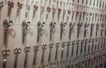
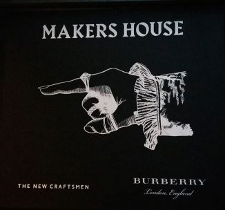
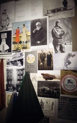
I was invited by a friend who works at Burberry to come and see the Makers House a collaborative pop up space between Burberry and the New Craftsman. An empty office building in Soho had been taken over and transformed for six days into a wonderful creative panoply of craft, fashion, food and entertainment all tied together with elaborate wallscapes of moodboards plucked from the historically-inspired vision of head creative at Burberry, Christopher Bailey.


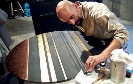
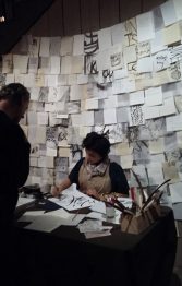
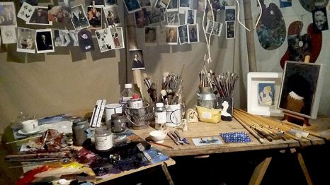
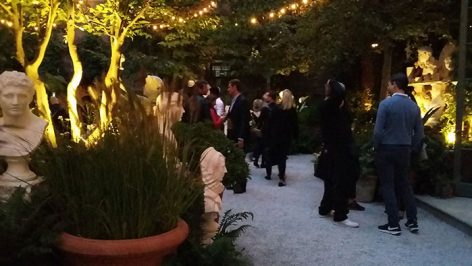
It was an enchanting space, entered through a dramatic tunnel lined with illuminated sculptuary and a delightful courtyard strung with lights. Inside, a sequence of areas were inhabited by working craftsmen, plying their trade lacquering or calligraphing within a mise en scène embellished with the tools of the trade. Inspired by Virginia Woolf’s Orlando and the interiors of Nancy Lancaster, the designer who ran Colefax and Fowler in the 1930s, the experience felt like a stepping back into an 18th pleasure garden interpreted through the eyes of a 19th century aesthete for the delectation of a 21st century audience.


M
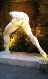
y nagging disgruntlement at the missing apostrophe in the event’s title, was assuaged only by the story that my friend told about how Burberry had to repaint the sculpture of a rather muscular, but disembodied pair of male legs and buttocks, as it had been covered in lipstick kisses from a multitude of drunken photo ops on the opening night!

Opening Someone Else’s House


I’ve lost count of how many times I took part in the Dulwich Open House event each year (was it 8 or 9?!) until I moved away from Dulwich last year. I’m hoping to be back for Open House 2017 as my new house is right on the edge of the Open House map. But in the meantime I really enjoyed last weekend when I pitched up to show in someone else’s house for the Nunhead Art Trail event.


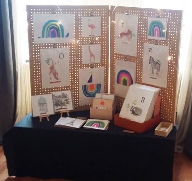
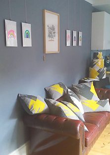
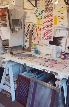
Printmaker Sarah Capel was lovely enough to invite Liz King, an artist/illustrator, and myself to show our work alongside hers. Our work is quite different and yet complementary in an array of bold colours, and it all came together very easily – although admittedly I didn’t have any of the tidying and cleaning of the house that used to take me longer than the actual set up!


It was wonderful to see a few familiar faces from the Dulwich Open, some of whom I remembered from years ago. It gave me a taste for opening my new house… though of course, first comes the challenge of actually getting it finishing first!

Best in Show

This year’s London Design Festival was upon us before I realised how out of the loop I was… normally I would be part of things, exhibiting in our usual Rivington Street gallery in Shoreditch, but being on maternity leave meant I was free to go and visit places. So one afternoon last week I went with a couple of other design-oriented mums to see designjunction which was in Granary Square in Kings Cross this year.


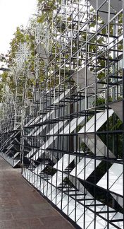
We stood in the street, buggies and all, looking for Cubitt House, the exhibition space, and somehow couldn’t see what was right in front of our faces…  the temporary exhibition structure had been clad in an intriguing scaffolding (above left) which created a kind of urban camouflage integrating the trees lining the road. I later found out this was a special facade which had been commissioned by designjunction from Satellite Architects but it had the effect of making the building strangely invisible to our baby-addled brains!

Design companies often go to great lengths to create temporary installations just for London Design Week and this year my favourite was the stunning lighting installation in the Central Saint Martins building by French lighting company Blackbody (above right). I’m a sucker for a sparkling canopy of light and this was spectacular.


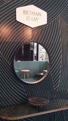
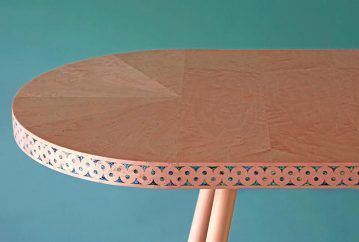
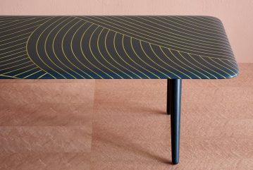
But ‘Best in Show’ undoubtedly went to our lovely friend and superb furniture designer Bethan Gray, whose stand we dropped in on. I’ve always loved her style, but her new collection is a showstopping culmination of everything else that she has so far designed under her eponymous design label. Her signature style, which brings together a love of materials with fabulous detailing, was expressed in a delicious palette of rich teal, salmon pink and midnight blue.

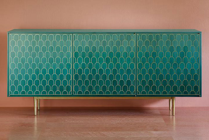
Nizwa cabinet
Her latest collection is a collaboration with Iranian artist Mohammed Reza Shamsian who has spent many years crafting unique pieces for the Sultan of Oman. Bethan’s husband, Massimo, told me how the biggest hurdle in the production process was not the fabrication – in fact the collection was created from sampling to launch in an unbelievably quick five months – but the packaging. I guess if you supply the Sultan of Oman, your furniture goes straight from workshop to palace and packaging is not really a consideration! Massimo explained that the packaging problem was solved by putting each piece in its own soft fabric bag – and I just love the idea of a piece of furniture coming in it’s own velvet pouch like a precious jewel.

My favourite piece was the Nizwa cabinet, made of maple wood marquetry in a teal ombré with an overlay of solid brass. It is absolutely stunning and I want one!  I can’t wait to see what Bethan comes up with next.

Back to Print


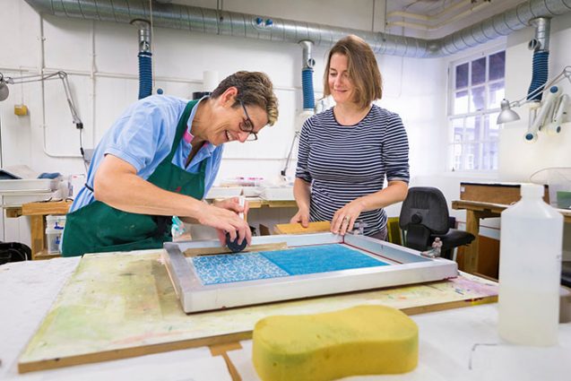
After 7 months of maternity leave, it felt strange getting back to work at West Dean given that last time I was teaching there I was two weeks away from giving birth! However I was straight to work preparing for the 5 day course “Printing and Sandblasting Imagery on Glass” which is a challenging course to teach, mainly because along with the two titular techniques, I was also teaching an introduction to Photoshop to prepare the imagery for screenprinting.


Ambitious, I hear you say?! Yes, definitely. Every day I found myself running out of time to cover it all. Photoshop is such an enormous topic, and one is only ever scratching the surface by attempting to teach beginners how to use it to produce imagery. However we were well served by the perfect new computers provided by West Dean, and my students dealt well with the constant change of scenery switching between studio and the computer room.


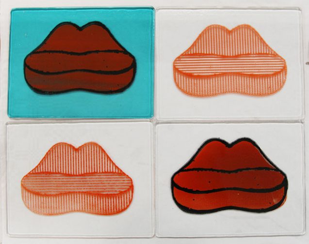
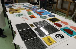
We covered both basic and some more advanced techniques for cleaning up and optimising imagery. I had one very able student who created some great pop art style imagery from photos that he took around the college. The famous Mae West Lips Sofa by Salvador Dali (a version of which pouts suggestively in the West Dean corridor) was photographed, stylised in Photoshop and recreated in two colour screenprint onto glass by the end of the second day.


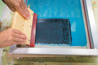
After all the hours of image manipulation on the computer, after the patience required to expose the image onto the screen, and after the careful mixing of the coloured enamels and the preparation of the glass, the fun of screen printing finally starts…. and it lasts about 3 seconds, if you do it right!


With a good pull of the squeegee across the screen you will see the magic of the screen printing technique. It might all be over very quickly, but it is satisfying to watch the colour transfer itself onto the glass below in a perfect rendering of the image you’ve slaved over.


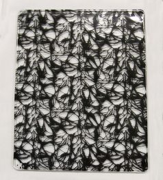
Several students managed to experiment with overlaying two prints in different colours and when you have the third colour of the glass below, you start to get some fun results. And then…. it was the last day, and we’d used up all of our playtime at West Dean until next time.

Archived Argument

I am going to try not to use this blog as a sounding board to expunge my rants about the delays in our house renovations. However it has been the most frustrating summer, with the builders having moved on to another project instead of waiting for the interminable process of hanging around for Lambeth Planning Department to get their act together.

While the house lies empty, and the front garden grows evermore jungle-like with weeds sprouting through the brickwork, I have been busy behind the scenes. I’ve been hidden away in the Archive Library for Lambeth, digging out old plans of the houses on the road in order to put together our argument for our second application.

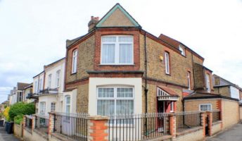
We want to renovate the house and three of the four phases we are intending to carry out require permission from Lambeth. The decision for two of the three phases are not down to the discretion of the planner and therefore should be straightforward – they merely require a certificate for Lawful Development which is a standard permission given under the remit of Building Control. However the first of our straightforward applications was – to my chagrin – rejected. Lambeth decided this on the basis that the side of the house is the principal elevation, because its front door is on this side and about 50 years ago someone changed the address of the house to the side road instead of the front road.
drain-application

Unfortunately the decisions for all three phases are going to hinge on this one interpretation of “principal elevation” and unless I can persuade Lambeth that the front is the main elevation, then we are going to have a string of rejected applications from here on in. If, however, Lambeth actually bother to pay attention to the fact that we are a bit of an anomaly and they allow common sense to determine their next move, then we’re onto a winner for all three phases. It really is an exasperating all-or-nothing situation.

So I have been taking copies of every relevant plan from the late 19th century archives when these houses were built. And it has been a fascinating process, not least because one starts to get a sense of the Victorian property speculators building these houses. Census returns between 1801 and 1911 show that the population of Great Britain almost quadrupled, rising from about 10 million people to 36 million. It is no wonder then that property speculation became big business, eventually creating a glut of houses for the more well off. Often living locally, these property developers would put up the funds for three or four adjacent houses. Thus you might get a terrace of nine houses, like ours, but with three different owners and displaying slightly different styles in the window, door and internal detail to show the individuality brought by each architect. The two end houses for the terrace might have the same overall architectural proportions, but will naturally be designed to a different floorplan and roofline because they are the two semi-detached bookends on the run of houses.


Our house is just one of those bookend properties with a matching house at the other end of the run. Both the bookends on this terrace have their front doors on the side but only ours carries a different address than all the others on the terrace. Going back through the census records to see how people have recorded their addresses, I could pinpoint the change of our house from Dodbrooke Road to Thurlestone Road in 1963. But why? Unfortunately the census does not record reasons, simply the results. What might seem strange is that there was a number going spare in the middle of Thurlestone Road, just at the point where our house was. In fact it seems that the owner of our house got their idea for changing the address from the house across the road, which a decade earlier had given up the number we eventually inherited.


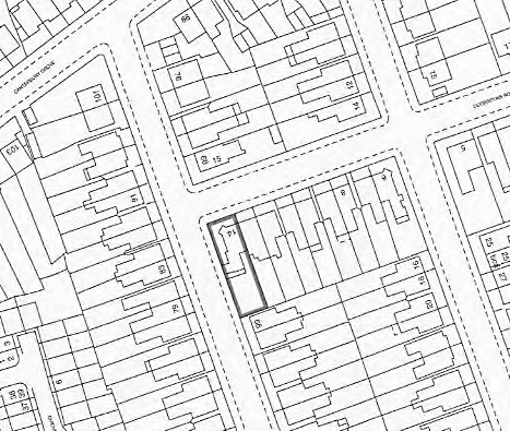
As a result the records for our house are a bit of a muddle with the Ordnance Survey maps to this day showing the old number with our current number being shown on the house across the street, which is mightily confusing. And yet, one might have thought that at some point in a period of more than 50 years, Lambeth might eventually twig that the two addresses relate to the same property, but no! When we bought the house, I was the one to bring their attention to this discrepancy in their records. How I wish now I had never been so efficient, as I probably could have got away with having every application rubber stamped under the original address and Lambeth would never have realised that it no longer existed.

Oh well, we live and learn.

In the spirit of learning, I went back to the Archive Library to research any information that might help me argue the case for treating the house as part of the terrace to which it is is so obviously the bookend and hence conceding the bleeding obvious – that the front is the front.
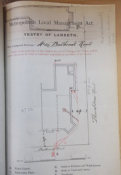
drain plan

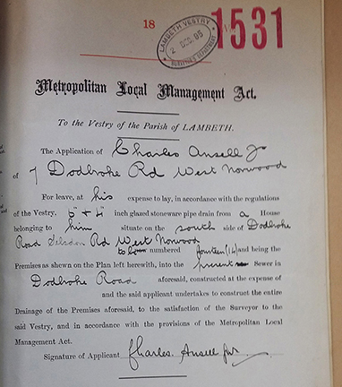
The Victorians were the first to introduce the beginning of what we know now to be Building Regulations. And it turns out that, while they were not interested in the look of the building or the integrity of the architecture, they were obsessed by the drains! From the middle of the 19th century, there was an increased importance placed on sanitation in properties and by the end of the Victorian era, hot and cold running water was available in the majority of homes. Outside toilets were constructed and enclosed sewers were built under the property. And one can see that by 1897 – when our house was built – the most important document for the local authority was a plan of the drains. This quite clearly shows the drains in line with all its the other drains on that terrace and joining to the main sewer on the front road not the side.

Well, this all adds up to what I think is a convincing argument that, despite having its door and address on Thurlestone Road, the historical documents (as well as common sense) tell us that the house is clearly part of Dodbrooke Road. Having done all this work myself, I then employed a Planning Consultant to make the application for me, assuming that an expert would know all the procedural requirements and how to state the case in a presentable form.

I was rather discombobulated to be charged a hefty £2000 for the Planning Consultant to copy and paste my argument (almost verbatim) onto her letterheaded paper for the application. It was rather mortifying to be charged for every six minutes of her time when I had to write three emails back to her listing all her spelling mistakes and grammatical errors; more horrifying still that on the third draft she was still spelling “principal” (as in the “principal elevation” at the core of our argument!!!) erroneously as “principle”…

Still, if her logo and letterhead lend the necessary weight to my argument to convince Lambeth, then it will be money well spent. We find out their judgement on the 18th of October.

Read the previous post about the renovation
A Tale of Two Artists


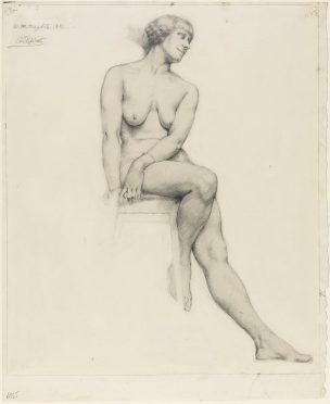
A recent visit to the Dulwich Picture Gallery opened my eyes to a local artist of whom I had not previously heard. Winifred Knights was born in 1899 in Streatham, very close to our new neighbourhood, and she went to my old school James Allen’s Girls’ School. She was a British painter influenced by the Italian Quattrocento but it was her drawings that blew me away; delicate, almost microscopic feathered linework, which appeared to have been rendered by an assiduously graceful hand and yet seemed to me to pulse with life out of the page.


A few weeks later I went to the showstopping retrospective at Tate Modern on Georgia O’Keeffe and despite the thirteen rooms of expansive canvases and her reputation as one of the giants of modern American art, I left feeling decidedly underwhelmed. Having never seen a Georgia O’Keeffe painting in the flesh, I had been expecting a sumptuous, sensual delight for the senses, but every painting just seemed to me to be flat, uninspiring and – dare I say it? – a little amateurish. As we left the final room and walked past a shop display wall covered in posters of her popular flower paintings, I wondered why the monumental Tate show felt like a triumphant display of the Emperor’s New Clothes, and yet the comparatively minor Dulwich show felt like discovering a bright, shining little treasure.

The two women were born within twenty years of each other, and both showed early artistic promise. Born in 1879 in Wisconsin, the young Georgia decided by the age of ten that she was to become an artist. Winifred too had begun to draw at an early age and, according to the Streatham News of 1920, “Even before she could properly talk the young artist cried out for “Chalk, Chalk”, which her mother supplied, and she was happy.”

Both women had teachers who were influenced by the Impressionist movement. O’Keeffe attended the School of the Art Institute of Chicago and then learnt under the tutelage of William Merrit Chase at art school in New York; Knights went to the Slade School of Fine Art in London where she studied under Henry Tonks. Both won the prize at their respective Art Schools as well as a subsequent scholarship which developed their careers and led each to meet her husband.


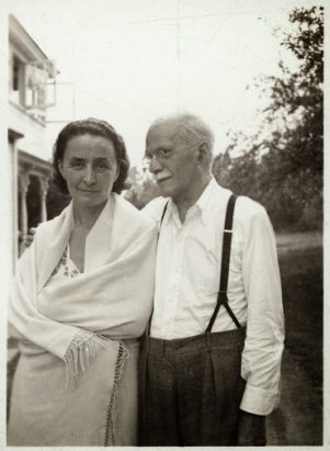
Georgia O’Keeffe started her career turning her back on her training in painting as felt she could not distinguish herself as an artist within the mimetic tradition, and instead she started work as a commercial artist and then spent several years teaching art, first as a teaching assistant and later as a head of department. Crucially in 1915 some of her charcoal drawings were shown by a friend to Alfred Steiglitz, the photographer and gallerist who was later to become her husband. Georgia was by nature a loner with a prickly personality, and her relationship with her husband has been described by her biographer as “a collusion … a system of deals and trade-offs, tacitly agreed to and carried out, for the most part, without the exchange of a word.” Yet it was this union which was ultimately to become the key to her success.


Steiglitz was 23 years her senior and as well as being a successful photographer he was an established art promoter, known for the New York galleries he ran in the early years of the 20th century. He 
made more than 350 photographs of her, some of which were nudes that created a public sensation in an exhibition of 1921. Through Steiglitz, O’Keeffe came to know many of his circle of artist and photographer friends by whose work she was inspired. It was he who first promoted her work, eventually organising annual exhibitions of her work which made her one of the most important American artists by the mid 1920s. And it was Steiglitz who first put forward the Freudian theory that her flower paintings – for which she is now best known – were in fact studies of the female vulva, an interpretation which was later to be picked up by the feminist artists of the 1970s, despite the fact that O’Keeffe herself denied its veracity. O’Keeffe outlived her older husband by 40 years, finally passing away at the age of 98 and leaving a legacy which included the Jimson Weed/White Flower No 1 which sold for 44 million dollars in 2014, the highest price ever paid for a painting by a woman at auction. 


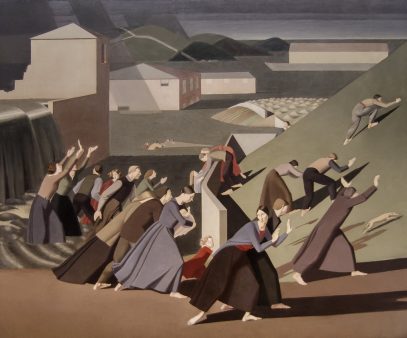
By contrast, when Winifred Knights passed away at the age of 47, she did not even receive an obituary. It was not until the 1980s, when one of her most lauded works The Deluge was rediscovered as part of a collection which had been consigned to auction, that her oeuvre of work began to be reassessed. The Deluge was the critically acclaimed entry which made her the first woman in England to win the prestigious Scholarship in Decorative Painting awarded by the British School at Rome. Winifred Knights moved to Italy to complete her scholarship. Her beauty and striking persona attracted attention from the moment she arrived and it was here that she first met her husband, the painter Thomas Monnington. On her return to England she was known for her distinctive dress, favouring the simple clothing style of the Italian peasant woman in contrast to the tubular silhouette fashionable in London circles. Knights worked slowly but steadily as an artist, exhibiting to critical success, and executing work for various patrons, including a commission on which she collaborated with her husband. They had a son together, after a previous pregnancy was tragically cut short by stillbirth, and she proved to be a devoted but over-anxious mother. An unsettled period with the onset of the Second World War mirrored the nervous breakdown she had suffered as a result of the First World War, and it brought her creative productivity to a standstill. Her marriage deteriorated as the war came to an end, and tragically the following year she suffered a brain tumour which killed her.

It is ironic that these two exhibitions were shown simultaneously in London, as they served only to underline to me how much success or failure can turn on a penny – how a fortuitous collaboration with the right person can ramp up a career to the superstellar levels or how fate can turn talent to nothing. It made me sad that Winifred Knights was clearly an artist with so much talent and yet was forgotten for so many years and I applaud the Dulwich Picture Gallery for putting on this, her first major retrospective (until 18th September).

Splutter Splutter

No one wants to read about the intricacies of someone else’s torment.

So I shall just keep to a minimum this diatribe about my ordeal at the hands of almost every window supplier/installer in London.

I have literally never come across an industry which is serviced by such a load of incompetent idiots.

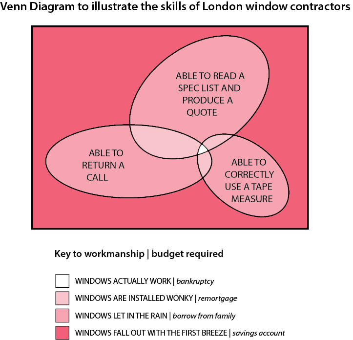
I have spent SEVEN MONTHS being messed around by one contractor after another. Apparently there is ONLY ONE company in London that is actually able to take correct measurements, follow clear written instructions and provide a meaningful quote….. the reason I didn’t go with them was that they were charging £35,000 (yes, you read that right) for me to replace my windows.

The situation is represented in the following Venn diagram:

Venn-ting


Read the previous post about the renovation

Read the next post about the renovation

Dismantled Panel

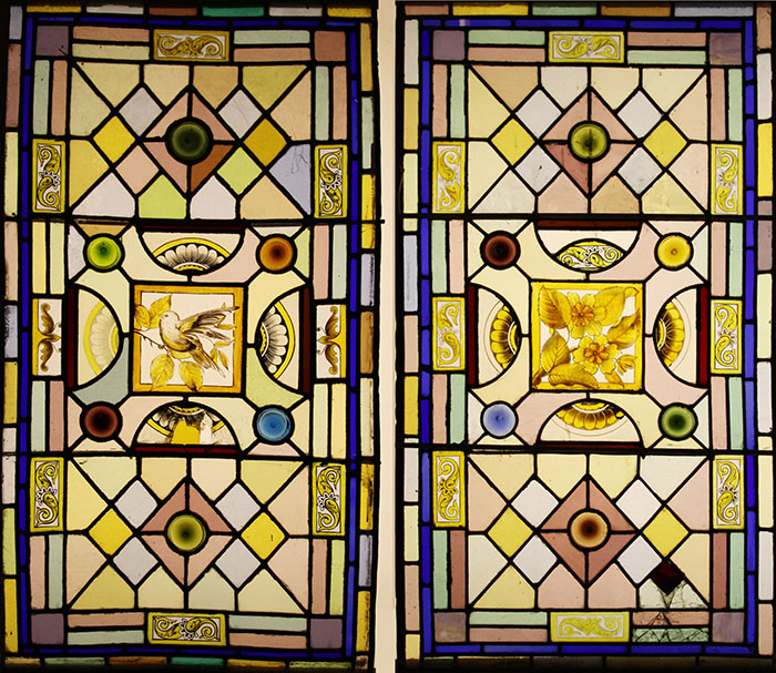
I’ve got two stained glass panels from the new house to renovate. They are potentially beautiful Victorian windows with some pretty painted sections, but various things have ruined them.

Stained Glass panels


Firstly there are lots of breakages all over the place and some bright spark has used araldite to glue completely different pieces of glass over the cracks. Secondly there are some odd discrepancies, like painted pieces which don’t match in colour or style or positioning, or painted pieces that were clearly made for other areas of the panel and then repurposed. This hotchpotch may have been done by the original Victorian artist using old scraps of glass, but I suspect these panels have been rehashed since then as there is also glass in there that does not look Victorian to me. Thirdly the colour balance has been so messed around with that it’s actually difficult to see the original scheme. Annoyingly it appears that the remedial work done to it was so unprofessional that the results are worse than the original problem… this is beginning to sound much like our house itself, the building from which they were taken out.

Once they were removed from the building I looked at the state of the lead to see if I could work with it, but it was so battered up I decided to dismantle the panel completely and start again with just the original glass.

This film shows the first stage of remaking one of these panels in which the lead lines are traced before the panel is dismantled. I’m working super slow these days given that everything is done during baby naps, so it felt good to use the magic of technology to speed everything back up to my pre-baby levels of efficiency!

Lambeth Rant

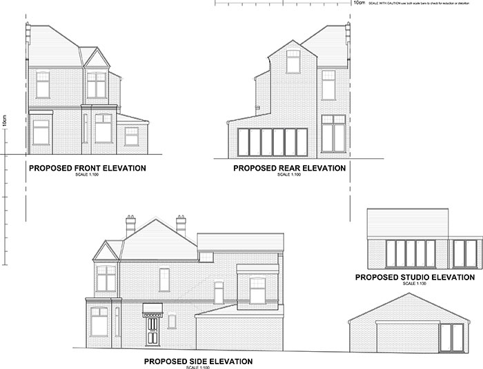
3D-drawing

RANT ALERT!  Our house renovation project has been put on hold for a month now and it’s looking like the delays will continue. That is a month of the builders not being there, which means a month longer (and counting) that this project is going to take and that we are going to be stuck in limbo, not knowing when we will be able to move in.

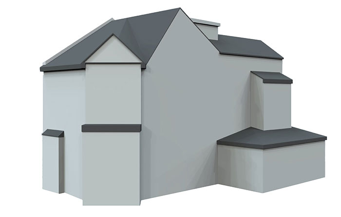
And why? Because Lambeth Planning Department is not only jaw-clenchingly incompetent but hair-wrenchingly inefficient. I have just had an excruciating 60 day wait on some written planning advice that should have been delivered to us back in March!! And the advice that Lambeth finally got round to bothering to write, informed me that because the front door is on the side of the house they have decided that this side is the principal elevation of the building. This, despite the fact that the architectural terrace it is part of, the layout of the drains, the original address it was assigned when it was built in 1897 as well as that small thing called COMMON SENSE would suggest that the front of the building is in fact the FRONT and not the SIDE. But because Lambeth have now decided that the side is the front, that means the front and back are now the sides and Lord only knows where the back now is!

Plans
But this decision has major implications for pretty much all the major building works we were planning on doing including, depressingly, the new hoped-for glass studio. The planning regulations for a principal elevation are quite different from those that concern other elevations on a house. And yet Lambeth want to have their cake and eat it too… I said to them if the front is now the side, then I should be allowed to make changes to that elevation – but, no, because it faces the street, I am similarly constrained on that side.

In an act of petty retribution for my endless delays, I put in a formal complaint about the planning officer who was dealing with my case, and demanded my money back. Typically – as if to rub salt in the wound – Lambeth complaints department builds in a delay to their response time so, frustratingly, I had to wait another month to find out that they had at least agreed with me that it wasn’t a good enough service and sent my money back. This has been little comfort when facing the seemingly insurmountable problem of how to proceed with my plans with this major spanner in the works.

I am now wishing that I had read the planning laws cover to cover before buying a house with a front door on the side….

Read the previous post about the renovation
Read the next post about the renovation
Creative Spaces


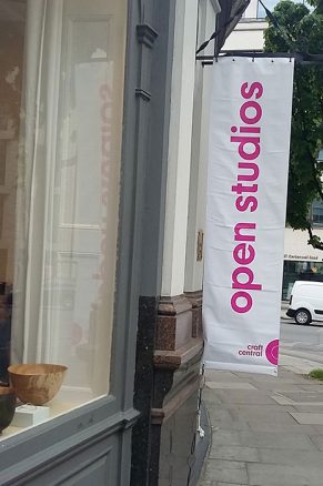
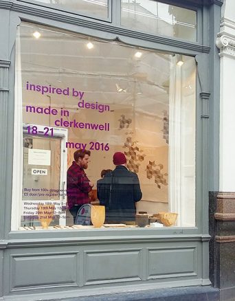
The Dulwich Open House put me right in the mood for visiting some more creative spaces and so last weekend I trekked up to Clerkenwell to look around the many studios open for the Made in Clerkenwell event at Craft Central. I’ve been a member of Craft Central for many years but I’d forgotten just how many floors there are across the two Victorian buildings as I’ve never made it all the way round this event in one go.


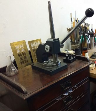
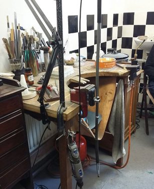
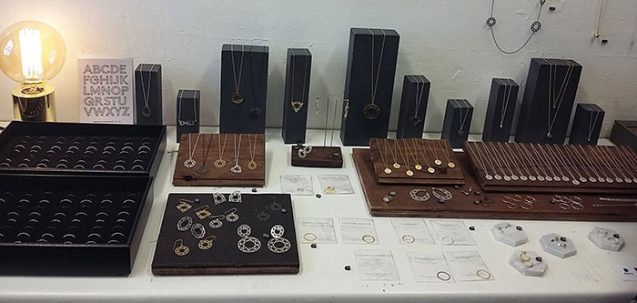
I’d also forgotten how many jewellers there are at Craft Central, which I think is a leftover from the days when the organisation constituted a group of jewellers known as the Clerkenwell Green Association before its rebranding as Craft Central. There was plenty of beautiful jewellery to look at and try on in the warren of studios lining the corridors of Pennybank Chambers. My favourite was the elegant geometric designs by Myia Bonner of Myia which were on display right opposite the bench on which they were made.

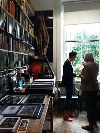
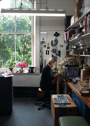
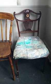
I always find creative spaces fascinating and as much an expression of their owners as the creations that are produced within their four walls. Neat and organised, random and empty, or packed to the gills with stuff, these are all the quirky working spaces from which emerge all manner of creative products. Sadly Craft Central will be closing the doors of its two Clerkenwell buildings next year as the landlords are selling off the site to the inevitable property developers that always seem to turf out the artists in every area in London. Some makers have worked from these studios for many years and are now being uprooted. Sarah Herriot (above right) described how the tree outside her studio did not even reach the window when she set up her studio here 14 years ago; the greenery is so prolific now, one would think the studio was somewhere in the countryside.

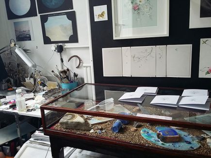
Sarah Hocombe is another artist who has been painting in her studio at Craft Central for many years but she is thinking about setting up at home. As an occupant of one of the few studios at Craft Central which has a window at street level, she has had a few commissions which came about from clients seeing her intriguing painting as they passed by outside. She had painted small egg tempera frescoes on fragments of bricks which were laid out in display cases as examples of her work.
painted wall detail

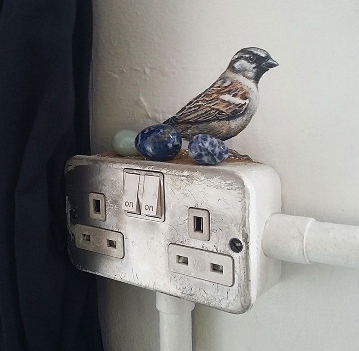
I also spotted a little detail of a mural bird who looked like it had laid three real eggs on the electrical socket. It’s desperately sad to think these little signature details will all be wiped out to make way for apartments for bankers wanting to acquire some Clerkenwell cool.