A Brief Visit to Southampton

I was delighted to have been asked back as one of four judges for next year’s Stevens Competition for Architectural Glass. The new brief for the competition has just been announced and it is a very exciting commission. St Mary’s Church in Southampton is commissioning a glass artist to design a stained glass window to commemorate the crew of the Titanic. Southampton sustained the greatest loss of life as virtually the entire crew of 1500 was drawn from the city. St Mary’s, its mother church, is closely connected with the ship which sailed from Dock Gate 4 close by and it was chosen as the venue for Southampton’s first memorial service after the disaster.

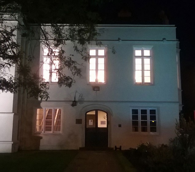
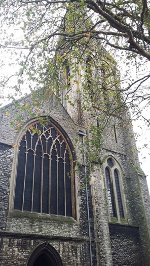
In early November I jumped on the train to meet the other judges at Southampton. We were driven from the station past the stadium of Southampton football club which has the nickname ‘the Saints’ as it originated from the church choir team. Pulling up in front of the church, we could see the neo-gothic architecture of the Victorian exterior which survived the blitz. 

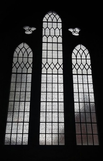
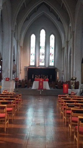
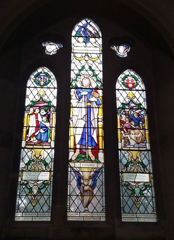
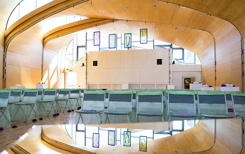
The building was gutted except for the baptistery, belfry and vestry and all the windows other than those in the baptistry were destroyed. The present church was reconstructed in the 1950s with a spartan neo-Cistercian interior and attractive stained glass windows which were modern interpretation of what had gone before.

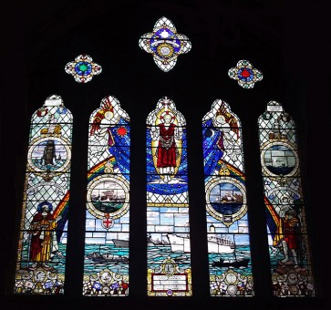
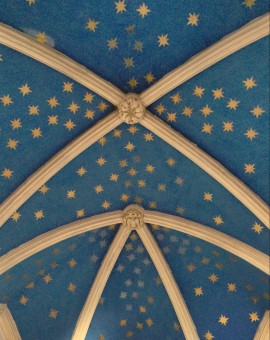
I particularly liked the window in the Seamen’s Chapel with its references to ships sailing beneath a rainbow and the drapery of a cloak emblazoned with stars like the unfurling firmament. Walking further round to look at the only original windows, I noticed the ceiling of the baptistery was also painted with gold stars on blue. My natural inclination – despite my role as a judge not an entrant – was to start coming up with ideas for the new window (old habits die hard!) and I immediately saw the potential link to an idea posited in the brief that 550 stars could be included in the design for the new window to represent the number of crew who died in the disaster. 

The new window panel will be built into the north aisle and the brief requires the design to incorporate a quotation from the Old Testament book Song of Songs – ‘Many Waters Cannot Quench Love’ – as well as the emblem of the White Star Line, the company which owned the ship. The site and the brief offer a rich source of ideas for what should be a very exciting commission.  

Read the competition brief here
Goodbye Home

Without even so much as a chance to unload my car after my October shows, I was back at home packing up my house and studio. We had spent the last month living among towers of boxes but I had ten days to fully pack up and move out. Then the day arrived when Pickfords turned up with a huge pantechnicon lorry, ready to take all the boxes away. Rarely do I consider new orders coming in to the Glass Studio as an unwelcome irritation, but unfortunately the post show orders were flowing in by telephone and email while I was trying to pack up the studio. I had the extraordinary situation of printing out my last batch of dispatch labels for the courier and turning my back for a moment only to discover that my printer, my computer and the desk that they had been standing on had been spirited away by the removal men!

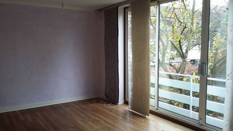
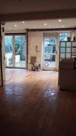
The final thing into the lorry was the heaviest and the most difficult to transport – my large kiln – which was forced grudgingly up the ramp with the last of the muscle power. After two days of high pressure, and a scramble of Pickfords men scurrying up and down the stairs, I found myself in an empty house. Nothing was left and the home in which I’ve spent the last decade felt strangely smaller. Before dropping the keys off with my estate agent at midday, I had twenty minutes of solitude, walking from room to room, and allowing ten years of memories to come flooding back.

A forgotten memory returned of the first time I came into the house in 2005. I had been looking for a house on the market with a space that could be used as a studio as I was just on the verge of graduating from college and starting full time as a glass artist, but none quite fitted the bill. However as I walked in through the front door of of 47 Pymers Mead – literally as I crossed the threshold into the garage space which was to become the studio – my mobile phone rang, and it was a call from the Worshipful Company of Glaziers telling me I had won the Stevens Competition. Knowing that the prize money would allow me to buy enough equipment to set up a studio, I took this as a sign that this was the house for me.

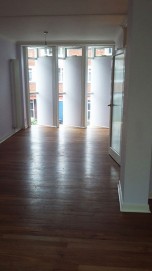
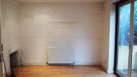
Walking around the empty space I reflected on how much this house has been about work. My work has been woven in and out of my family life until it is impossible to separate the two. And strangest was seeing the studio walls, which were formerly groaning under the weight of shelves covering every spare inch of space. The industry of this studio had literally imprinted itself on the bare walls in the grubby silhouettes of shelves, folders, jars and tools, like the dusty ghosts of a decade of toil.

Gala and Glaziers

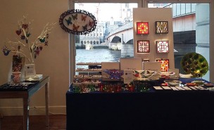
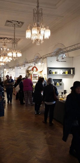
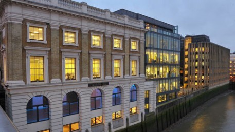
Having back to back shows is never much fun, and with barely 24 hours between the end of Made London in Marylebone and the start of the Glaziers’ Fair in London Bridge there was barely time to catch my breath. However the second show was (thankfully) much smaller and required only a simple set up, albeit in the grand surroundings of the River Room at Glaziers’ Hall. It was lovely to watch the river rise and fall at London Bridge right outside the window and quite different to doing trade shows in anonymous event halls.
Unfortunately both shows were blighted by numerous phone calls from various estate agents and solicitors trying to agree the final terms of sale of my house and purchase of our new home…. it’s difficult to do a soft sell on passing customers while simultaneously getting into hardcore negotiations on the mobile!
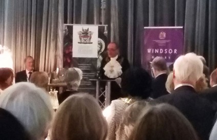
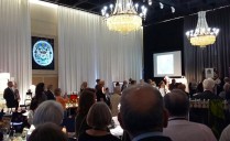
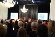
So the gala evening, held on the first evening for the University of Oxford Alumni Network, was a welcome break from these complicated discussions to indulge in some canapes and sell some glass to the amassed alumni.

MADE London

Made London took up residence in the church at Great Portland Street four years ago and has gone from strength to strength since then. I have had Made London on my exhibiting radar for quite some time as I had heard good things about it as a central London selling show. Particularly since the demise of Origin – and its predecessor, the Chelsea Craft Show – there hasn’t really been a large regular show in London curating contemporary crafts for a dedicated database of customers, but Made London seemed to be confidently claiming that position.


When curating our own show Designed | Crafted last year, we picked up a couple of makers from last year’s Made London who we thought were a great fit and one of them turned out to be Sarah Young, who also happens to be one of the organisers of Made London. It wasn’t until I spent a day invigilating our own show with her partner Jon Tutton that I heard about Made London direct from the horse’s mouth, as it were, and I decided to apply this year.


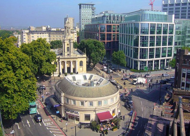
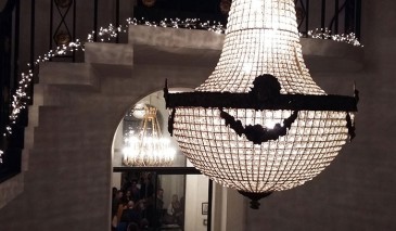
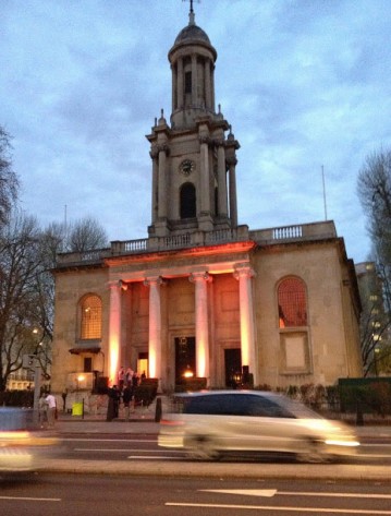
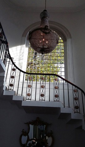
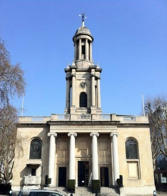
I was happy to have made it past the selection panel, as there is now a long list of disappointed applicants who try to get in to exhibit each year at One Marylebone,  the wonderful venue that is used for the show. Originally built in 1826, the Holy Trinity Church was one of only three churches designed by Sir John Soane but it was considered the most architecturally distinguished. It was sympathetically renovated and reopened in 2008 as a leading London events venue, and Made London has been occupying it for a weekend in October for the last four years. It is a magnificent space, with four levels each having its own feel which adds to the atmosphere that this is a unique selling show in the Craft calendar.


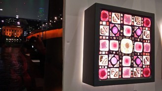
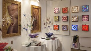
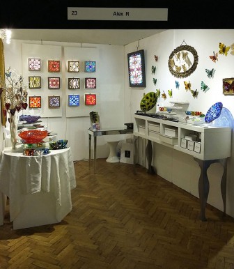
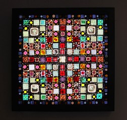
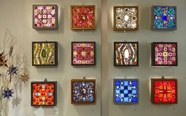
I took a large stand on the first floor galleries which had beautiful tall arched windows all the way along. Having a lovely big stand meant I had space to exhibit my Global Treasury lightboxes which I rarely display because of the space required. Hiding the electrics is always a bit of a faff, but it was well worth it this time as I mounted twelve lightboxes on the back wall plus a new piece based on the Global Treasury range but made much larger at 60cm square.

Good sales of the lightboxes during and after the show made me reconsider my Global Treasury lightboxes. I realised, with some nostalgia, that these were in fact my very first collection of retail items – they were the first pieces I thought about in terms of a product range with distinct patterns designed to be replicated. I enjoy making batches of these lightboxes as there is enough scope within them to play with colour so as to make each one unique even though they follow an overall design. Also because the cost ratio of materials to labour is favourable it means I have been able to keep the retail price consistent over the years. Although I have streamlined both the number of designs in the range, as well as the making process, the one thing I have never managed is to hone the making process down to the bone to supply them at trade prices, despite having had numerous requests from my stockists over the years. Maybe this could be a challenge for next year?

The White Road

The-White-Road

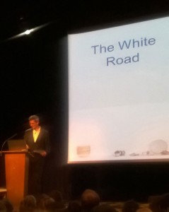
As a birthday treat for myself I got tickets for a talk by Edmund de Waal on his new book about porcelain, entitled ‘The White Road’. He was talking at my son’s school, so I dragged my son along for a rare injection of culture in his teenage world. He was superbly disinterested at the prospect of going, but perked up slightly when he realised that de Waal was the dad of one of his fellow pupils.

I didn’t know quite what to expect. I had enjoyed ‘The Hare with Amber Eyes’, de Waal’s first book which traced the history of a cabinet of Japanese ‘netsuke’ back through its ownership by various members of his family. However, where that book was cleverly woven through with an intriguing family history and insights into de Waal’s own obsession with collecting, I worried that a history of porcelain might be a bit heavy going and niche for a disinterested teenager!


However de Waal spoke engagingly, and his obvious enthusiasm for his subject infected the audience, who were entrusted to pass around a few pieces of 12th century porcelain that he had picked up at Kao-ling (after which Kaolin clay is named) in China without pocketing them (de Waal said he trusted an audience from Dulwich!)

He started the slideshow with a photograph of his studio wall, upon which he had written a list of locations around the world where he thought his journey might take him in researching the origins of porcelain. A flurry of images over the next hour traced that pilgrimage from the Jiangxi province in China, to Versailles, to Dresden, to Cornwall, to the South Appalachians, where he took his own teenage son to see the diminished kaolin deposits in the Cherokee National Forest, and to the porcelain works at Dachau.

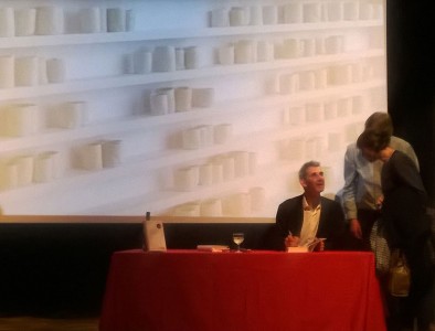
It was a breathless journey that took in various curious stories of eccentrics, innovators, craftsmen and collectors, and we all just about stayed on board for the ride. There was a book-signing at the end, but when I saw the enormous size of the tome on sale to those who hadn’t already obtained a copy, I reconsidered the purchase. In that critical moment, I’m afraid I reverted to my own form of teenagerism, and thought: enough porcelain for one evening!


Love, Requited

Wedding Venue

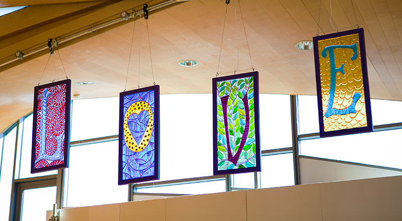
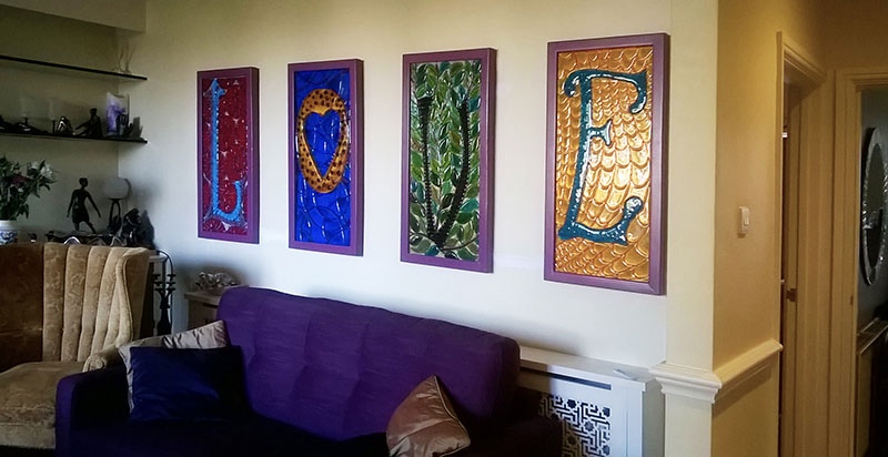
A couple of years ago I made four panels to hang at my wedding. They spelt the word LOVE, which was obviously intended for its romantic setting.

Wedding Panels

However there was another context for the panels as they were going to be delivered straight from the wedding venue to a show at the William de Morgan Centre in Wandsworth Museum and the backgrounds to the lettering were all taken from patterns on various de Morgan ceramic pieces.

William De Morgan ceramics

William De Morgan was a contemporary of William Morris and collaborated with him for many years, and both were advocates of the famous line Morris wrote for an 1880 lecture on ‘The Beauty of Life’ for the Birmingham Society of Arts and School of Design: “If you want a golden rule that will fit everybody, this is it: Have nothing in your houses that you do not know to be useful or believe to be beautiful.”

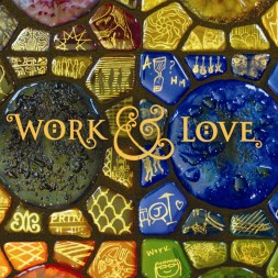
I have always been inspired by the Arts and Crafts movement, and the way in which its proponents seemed to successfully turn something they loved into an industry. Five years ago I named my debut solo exhibition at the Menier Gallery “Work and Love” with exactly this idea in mind. So it seemed fitting to me to draw inspiration from the Arts and Crafts designs to illustrate the word “Love” in my wedding panels.

My Love panels have been displayed in various ways since, but I had always intended to turn them into lightboxes for display on a wall. This year I mounted them on the wall of my stairwell for my Open House and a local couple rather fell in love with them and wanted to buy them for their own house. The frames were painted a Liberty-style purple but I had the frames specially lacquered to the exact mauve that they required to fit into their home decor. We had discussions about how they might be turned into lightboxes but, having trained as an engineer, the husband took it on as his own project to arrange.

Love Wall

It was wonderful to be able to drop off the panels, and come back a few weeks later to see all the technical and practical complications of installing lightboxes had already been done!

Butterfly wall

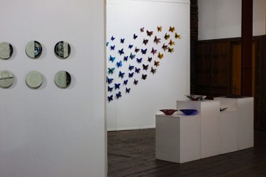
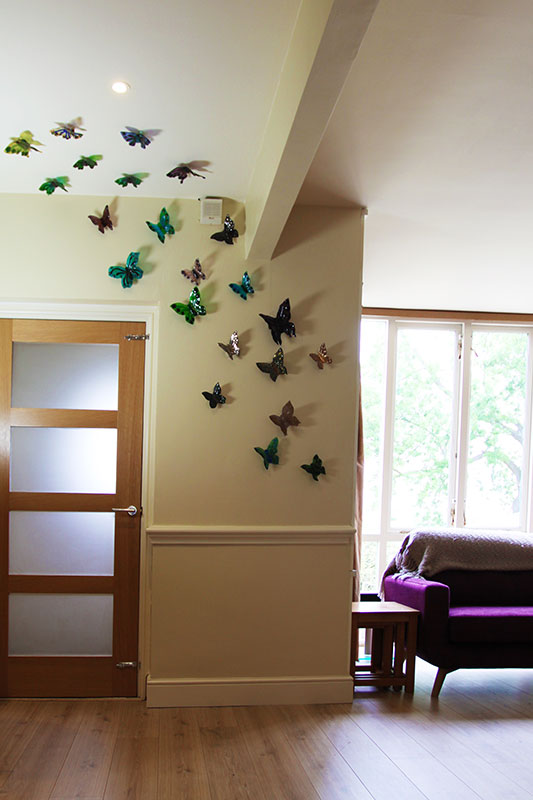
It was also rather lovely to see that the clients had amassed a collection of wall butterflies from me which complemented the glass on the other side of the room.

Upcoming Shows

I have two shows coming up in October.


From the 22nd to the 25th October I will be at Stand 23 at MADE London. This Design and Craft fair is fast becoming one of the top selling events for designer makers in Europe, showcasing the very best and most original makers in this country. Visitors to MADE LONDON are always impressed by the variety, quality and originality of the craft and design on show; and love exploring each of the four levels of the dramatic and beautiful building at One Marylebone.


On the 27th and 28th of October I will be at showing at the Glaziers Fair alongside three others Teepee Glass members who will also be there. This is the first time The Worshipful Company of Glaziers has held a fair and it will be in the magnificent setting of the Glaziers Hall on the River Thames at London Bridge. Forty six exhibitors (mainly glass but also other media) will be selling at this fair.

These are both perfect opportunities to get some early handmade Christmas presents which are more unique and thoughtful than the standard high street fayre.


The Thrill of Liberty

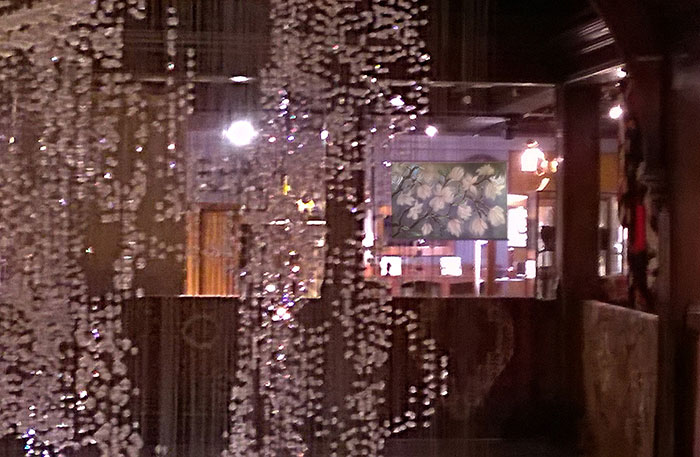
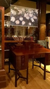
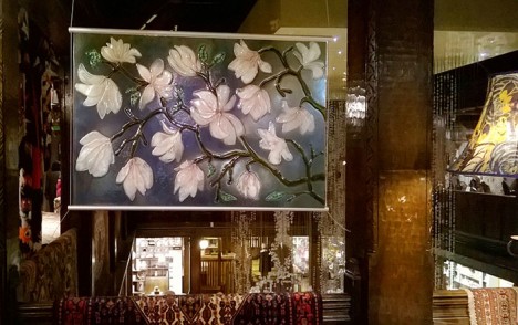
I was thrilled, thrilled, thrilled to see my work in Liberty! I love Liberty, I love its Arts and Crafts connections, I love its history and any maker would be honoured to have their work in the store. So it was a lovely surprise to glimpse my Magnolia panel through the lighting installation hanging in the atrium.

Liberty-interior

My hanging glass artwork is featured on the fourth floor balcony thanks to Patch Rogers who runs the Arts and Crafts Department.


It was wonderful to see my contemporary glass panel hanging alongside original Arts and Crafts furniture, although I was slightly surprised to see it had actually been hung upside down! Not that it matters, but it was curious to see that whoever installed it preferred it with the flowers facing down instead of up. Beauty is evidently in the eye of the beholder!

Launch of The Dulwich Notebook


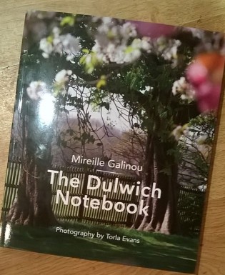
I was invited to attend a book launch at the Old College building of the Dulwich Estate. The whole notion of the self-appointed fiefdom that the Dulwich Estate holds over its residents does not sit well with me and, frankly, I will be glad to escape its bureaucratic clutches when I move my house and studio out of West Dulwich next month. However none of this resident’s acerbity applied when attending the launch of The Dulwich Notebook by Mireille Gallinou, as it is a delightful celebration of all the good things about Dulwich, centring around its history, its topography and its local businesses.


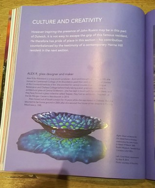
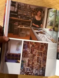
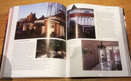
Best of all – for me at least – was that I am featured in the book! Mireille brought her photographer Torla Evans to my studio months ago, so I knew I would be in the book in some form. However I’d forgotten that they also took pictures in the rest of my house and garden as the author was particularly interested in the 1960s architecture of my estate, and as I flicked through the pages I was excited to see lots of pictures of me, my work, my studio and my house! I was also thrilled for Mireille that what I had understood was to be a brief Book-of-Days-style notebook had actually turned into quite a weighty well-researched tome that will hold much interest for anyone living in or around the area.

Ai WeiWei

For the whole of September I was intending to go to the Joseph Cornell exhibition at the Royal Academy, but I always underestimate just how all-consuming putting on our own show is every time we do it. And so it was that it came to the penultimate day of the Royal Academy exhibition and it was my only day off, and I only had an hour before closing time to get round.


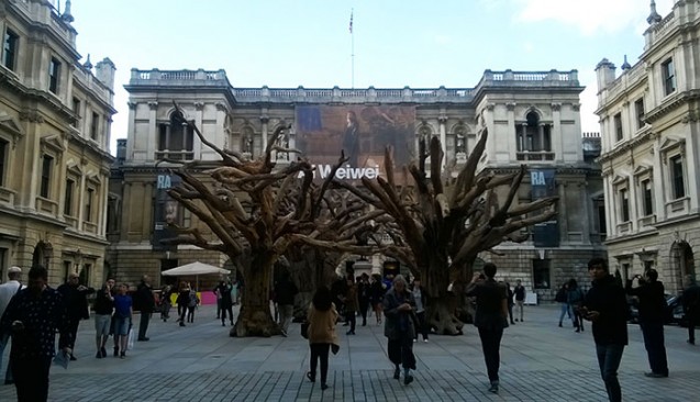
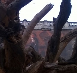
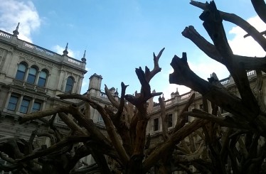
What I should have done was to spend the entire hour focussing on the wonderful Cornell shadowboxes, which I have always been rather in love with but which I have never seen in real life in any great number. However queueing in the Royal Academy courtyard I was rather enthralled by the newly erected ‘Tree’ installation by Ai WeiWei, whose exhibition had just opened. With eight trees constructed from the parts of dead trees using hidden joints and industrial bolts, the installation made for an arresting sight against the eighteenth century building. So stupidly I bought a joint ticket which gave me only half an hour in each exhibition.

I zipped round the Cornell exhibition, trying to cut through the crowds who had obviously left it till the last minute like me. Perhaps it was the pressure of the crowds, but somehow the readymade assemblages didn’t speak to me in quite the way I expected them to.


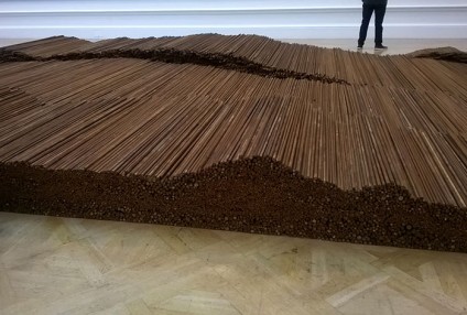
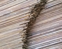
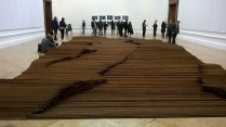
On the contrary, moving round the monumental pieces in the Ai WeiWei show downstairs was not only easier but somehow more engaging. It was helped by the audioguide which, for the first time at the Royal Academy, was given freely as a result of being sponsored by Ai WeiWei himself who is keen to have his audience understand the context of his work. Much of his work is filtered through the political lens of being a Chinese dissident, and the central work of the exhibition, ‘Straight’, is both an homage to his fellow countrymen who died in the 2008 Sichuan earthquake and a criticism of corrupt Chinese officials who compromised on building safety standards to line their own pockets. The huge work unfurls across the floor, 150 tonnes of steel rebar taken from the mangled wreckage of schools destroyed in the disaster, carefully straightened and laid in undulating layers, flanked by wall panels listing the names of all 5,196 children who died.


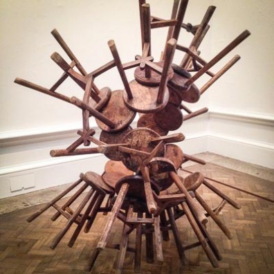
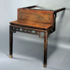
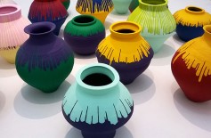
A number of pieces were concerned with the adaptation, conflation and fetishism of China’s cultural artefacts, which act as a commentary on the iconoclasm of the Cultural Revolution. Furniture from the Qing Dynasty has been bastardised, with unexpected folds and corners expertly incorporated into the antique pieces by skilled cabinet makers. Tables to appear to climb the walls, stools look like they are cloning themselves in an ever-growing cluster, and enormous wooden columns from antiquity pierce and embed themselves into delicate tables. From a maker’s point of view, these pieces are both a wonder of craftsmanship and yet sit unsettlingly with the notion of the preciousness of the craftsman’s hand. This uncomfortable paradox of adapting centuries-old craft pieces was most apparent in one of the later rooms which displayed a collection of Han Dynasty urns dipped by the artist into emulsion paint in lurid colours. I thought they were rather beautiful and would have happily held their own in any contemporary craft show, but they have courted controversy since he started adapting them in the 1990s.


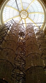
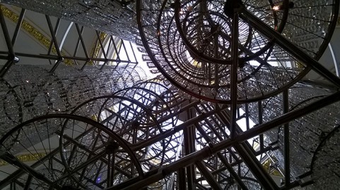
Unusually, we were also allowed to take pictures, though I didn’t realise this until half way around when my window of opportunity was shortened even more by bumping into friends in the main room. The piece in the final room had everyone reaching for their mobile phones to take pictures of the stunning forms of ‘Bicycle Chandelier’, a site specific sculpture consisting of hundreds of everyday bicycle wheels acting as the structure for cascades of white crystals to create a breathtaking chandelier.

The exhibition continues until December and it will definitely be worth a second visit.