A Brief Visit to Southampton

I was delighted to have been asked back as one of four judges for next year’s Stevens Competition for Architectural Glass. The new brief for the competition has just been announced and it is a very exciting commission. St Mary’s Church in Southampton is commissioning a glass artist to design a stained glass window to commemorate the crew of the Titanic. Southampton sustained the greatest loss of life as virtually the entire crew of 1500 was drawn from the city. St Mary’s, its mother church, is closely connected with the ship which sailed from Dock Gate 4 close by and it was chosen as the venue for Southampton’s first memorial service after the disaster.

In early November I jumped on the train to meet the other judges at Southampton. We were driven from the station past the stadium of Southampton football club which has the nickname ‘the Saints’ as it originated from the church choir team. Pulling up in front of the church, we could see the neo-gothic architecture of the Victorian exterior which survived the blitz. 

The building was gutted except for the baptistery, belfry and vestry and all the windows other than those in the baptistry were destroyed. The present church was reconstructed in the 1950s with a spartan neo-Cistercian interior and attractive stained glass windows which were modern interpretation of what had gone before.

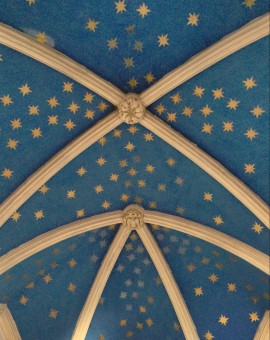
I particularly liked the window in the Seamen’s Chapel with its references to ships sailing beneath a rainbow and the drapery of a cloak emblazoned with stars like the unfurling firmament. Walking further round to look at the only original windows, I noticed the ceiling of the baptistery was also painted with gold stars on blue. My natural inclination – despite my role as a judge not an entrant – was to start coming up with ideas for the new window (old habits die hard!) and I immediately saw the potential link to an idea posited in the brief that 550 stars could be included in the design for the new window to represent the number of crew who died in the disaster. 

The new window panel will be built into the north aisle and the brief requires the design to incorporate a quotation from the Old Testament book Song of Songs – ‘Many Waters Cannot Quench Love’ – as well as the emblem of the White Star Line, the company which owned the ship. The site and the brief offer a rich source of ideas for what should be a very exciting commission.  

Read the competition brief here

Glass Sellers Dinner

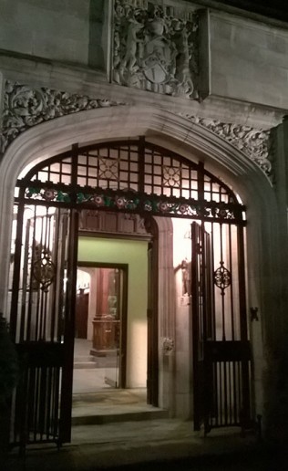
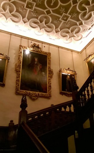
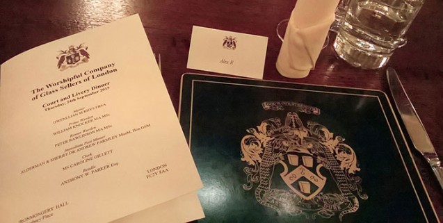
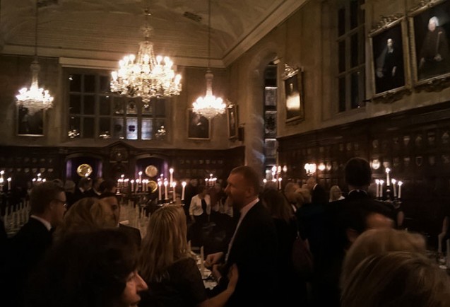
A few months ago I applied to a competition run by the Worshipful Company of Glass Sellers. My competition entry was highly commended and as a result I was invited to the prizegiving dinner at the Ironmongers Hall in the City. Being accustomed to the other guild, the Worshipful Company of Glaziers and Painters, it was interesting to find out that the Glass Sellers don’t have their own Hall so they use various venues for their events. I was told the Ironmongers Hall was the most grand of all their dinner venues, and it was indeed a beautiful building, a 1920s Tudor style hall rather incongruously surrounded by the modern architecture of the Barbican.


However once dinner commenced, the customs of the Worshipful Company were familiar from dinners I’ve been to at Glaziers Hall, most notably the tradition of the passing of the Loving Cup.


In this communal act of conviviality, a silver gilt vessel is passed down the table from which each attendee is to drink. Harking back to times when drinkers may have been attacked by sword while they were otherwise engaged, the deep rooted custom of the Loving Cup is for each member to sip from the up with one member standing behind, back to back, and another standing in front, face to face, to protecting the drinker from attack.


After dinner we withdrew into a side room where the display of of competition entries were for sale to the assembled members. I was delighted to see that both my samples had been sold.

The Final Judgement

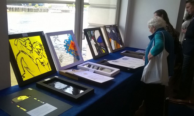
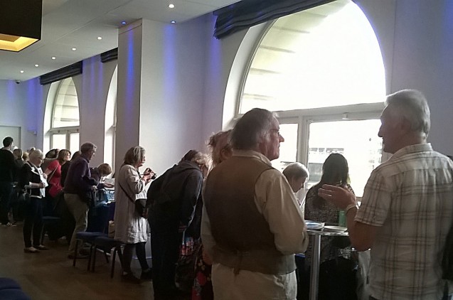
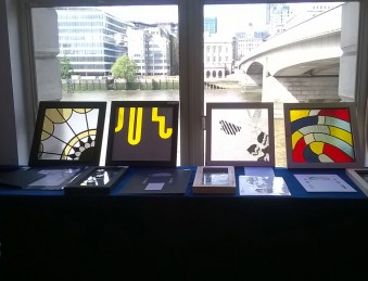
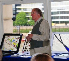
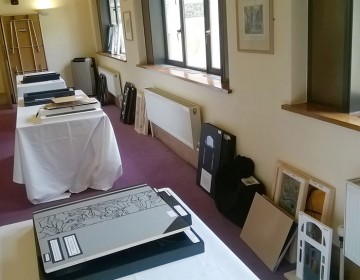
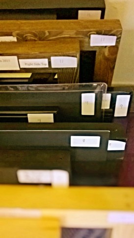
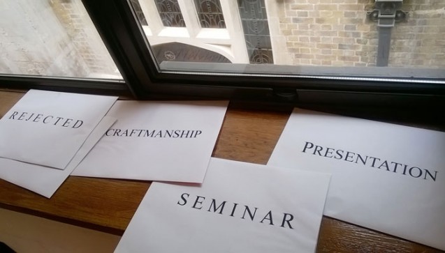
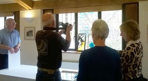
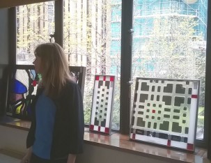
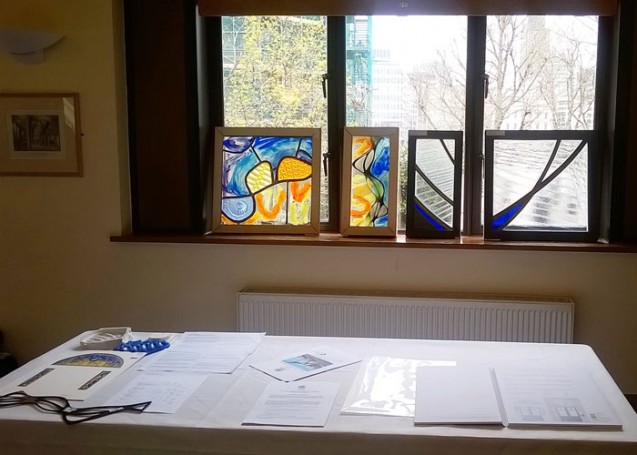
The Stevens Competition prizegiving day was on Tuesday and though we were one judge down, we had a lively seminar between Helen Whittaker, Douglas Hogg and myself, the three judges that were left. The seminar is traditionally held at the magnificent Glaziers Hall on the river at London Bridge, where the competition entries are spread around the River Room for students and visitors to look at before a group discussion. With fewer entries this year than in previous years, we were able to lean all the entries against the windows with a wonderful vista across the River Thames, and it was lovely to see all of them at once, as opposed to the judging day when we were shown the panels in groups of six.

Just before the students came in, we three judges had a conflab and decided that the chairs were too widely spread to create a sense of intimacy in the ensuing discussions, so we rolled our sleeves up and tottered here and there moving the furniture around in our high heels (Helen and I, that is – Douglas had chosen more sensible footwear!).

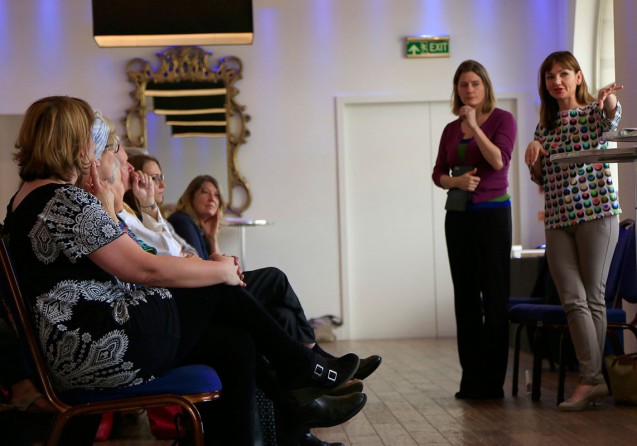
And then it was time for the students to enter to hear our verdicts and our feedback on each of the panels on show. I found my outlook subtly shifting gear from the critical judging eye that we had employed when filling out the mark sheets for each panel, to the softer, more educational stance we needed to take in order to deliver our feedback to the artists. Helen voiced my own feeling that at times like this, we feel we are no more qualified than anyone else to proclaim which panels are good or bad; certainly for my part, it feels like not long ago that I was one of the students waiting to make sense of the feedback delivered about my own efforts in the Stevens Competition. However we were brought into do a job and, on the whole, we largely agreed about the general verdict on most panels.

It was lovely to hear the students themselves explain their own motivations for the designs and to see the genuine pride in the faces of the winners. However a downside was hearing from one student who came up to me after the seminar and said she felt she had failed because the sum of her marks in the various judging categories added up to less than 50% of the total available marks. She felt dejected and expressed doubts that she’d want to enter the competition again. I tried my best to assure her that the marking system was not necessarily a reflection of the quality of her panel, but I suspect she thought I was just back-pedalling. I have thought about this more since that day, and I stand by what I was trying to explain to her. When marking panels which are set against each other in a competition, one marks differently from how one would assess a panel on its own merits. It is the difference between the judging eye and the educational stance, that I was alluding to earlier. When one is marking to judge, one has to ensure the aggregate marks are differentiated from panel to panel…. in other words, one starts by imagining the panels in order of strength in each criterion and one mentally gives, say, the eleventh panel out of the sequence of twenty one a mark at roughly 50%. Then the ten stronger panels in the imaginary sequence would be graded above 50% and the ten weaker panels would be graded below. That is not to say that the eleventh panel is only half as good as it could have been but, for the judging process, the difference between the marks aggregated by each panel is more important than the marks themselves.

Unfortunately the girl I spoke to didn’t understand that this was what the marks represented and took her below 50% mark to be a damning indictment of her work. It was a great shame because her work had a lot of excellent qualities, but in this case they were just not quite right for this commission for Swansea University. As I said to her, if the commission that has been discussed by the Glaziers as a possible candidate for next year’s competition goes ahead, then I would anticipate her particular style would be very well suited to that competition, and I hope that she reconsiders applying again.

A Gift and a Curse

My last blogpost expressed my frustration at the lack of polish in the students’ presentation of their competition proposals. While I was away from the studio last Monday judging the Stevens Competition, my little kiln was busy firing my own glass samples for a competition. The theme of the competition was Innovate | Communicate and entrants were asked to make a pair of favours for a Banquet at Mansion House (see all the competition entries here).

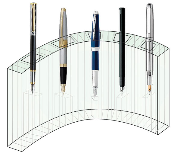
Design for penholder
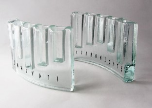
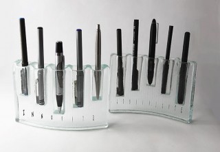
I had considered the theme and I wanted to make something which could be kept on a desk – the place where most designers, thinkers, writers and business people communicate and innovate – so I designed a cast and slumped matching pair of curving glass pieces which were to function as contemporary desk holders for pens. The words “Innovate” and “Communicate” were printed within each respective pen holder. I had spent a long time making little samples trying to work out the correct sizing to fit even the biggest fountain pen and I finally made a finished version which looked good and felt stable.

However when I went to package it in my signature giftbox, I realised I’d miscalculated something as it was still slightly too big to sit comfortably in the box. I was running out of time before the deadline – cast pieces always take forever in the kiln – and my brain went into overdrive to come up with clever ways to support the glass in the giftbox at an angle which just allowed it to fit.

Then a wonderful email arrived in my inbox from the organiser of the competition saying that she was extending the deadline by a week. What a lovely surprise! I had plenty of time to make another pair at the perfect – slightly smaller – size. With the luxury of time on my side, I could even tweak and perfect the making technique.

So when I chatted to John Reyntiens on Monday – one of my fellow judges who also happened to be entering the competition – I was confident of easily making the extended deadline of Friday. And yet, later that week when I opened up the kiln to inspect my perfected pieces, my heart dropped through the floor and the cursing that was to be heard would have made any West Dulwich resident blush….. I had made a stupid, stupid error!

Jumping e

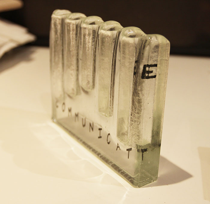
The bitter irony was not lost on me that while I was being all sanctimonious about the students not paying enough attention to detail, I had not noticed the most basic of errors in my own work… the word ‘Communicate’ looked like the “e” was making a bid for freedom!! Stupidly I had put the “e” in upside down so it appeared at the top of the piece, not the bottom. How had I not spotted this before it went in the kiln?! After the swearing had subsided, I reflected that this was probably karma biting me back for being so unforgiving when judging the student work.

I did not have time to make another one. Last week, the first version looked perfectly acceptable, albeit too big for the packaging, but now, having been offered the extended deadline, I had come to view the older version with disdain, knowing that I had time to make a truly perfect version. And yet my new version now looked ridiculous!

Should I submit it anyway, allowing people to think the jumping “e” was intentional? Should I submit it in its perfect giftbox with a shameful note of explanation? Or should I settle for the old version, which now looked so clumsy to my perfectionist’s eye, sitting awkwardly in its box?

As I went to bed that night I thought about my experience as a judge on Monday and I realised, with a leap of perception, that I am actually far more critical and less forgiving of my own work than I am when looking at other people’s work. I reminded myself that although I was complaining about the students’ scrappiness in the written presentation of their ideas, I was very much more generous and open-minded when looking at their actual glasswork.

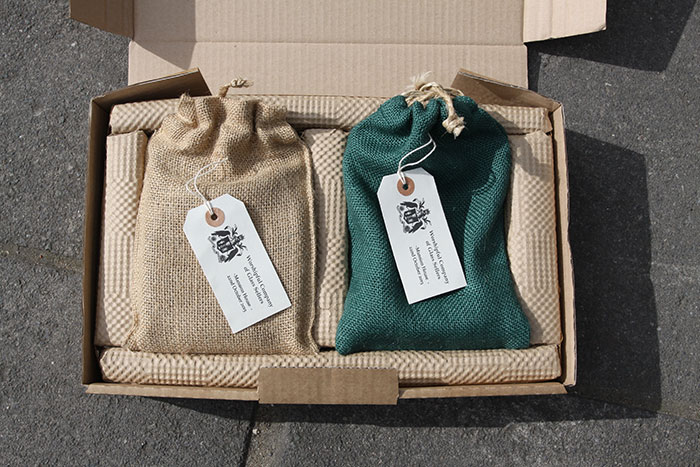
I slept on my decision. The next morning I awoke with a compromise solution. To my eye the original set of samples would now never seem perfect, but to anyone else’s eye they would be fine. And the packaging problem? I did the unthinkable, and abandonned the idea of using my giftbox altogether…. for someone like me who produces fairly commercial products this was a bit horrifying as it meant losing my branding. But within an hour I had googled a great company who make drawstring pouches out of jute, and suddenly I had a solution, albeit a very longwinded one as it involved me driving to the other side of London and then a long detour back via Art Logistics in west London to drop off the finished pieces. All that driving gave me time to reflect that the extended deadline had been a gift, but it had also resulted in me being subject to the curse of my own perfectionism.

Finished and packagedOne day I will achieve it, but for now I can but dream of the day when I can think my way to an acceptable compromise without needing the pressure of a deadline!

Competitive Spirit

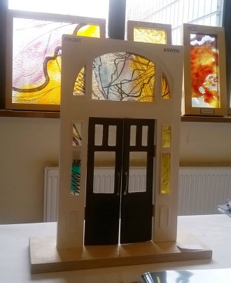
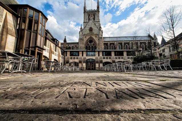
I took the train up to London Bridge on a lovely sunny Monday morning this week to do my judging duties for the Stevens Competition. Glaziers Hall was unavailable so we had a lovely room in Southwark Cathedral Conference Centre with lots of windows to view the sample glass panels. Ironically the site where the finalist’s panels are to be installed is in a corridor with substantially less light, so this was a critical consideration from the beginning.

However as a first time judge, I had a lot of other criteria to get my head round before anything else. The four judges were given a short introduction and then we worked in half hour segments, viewing and marking 6 panels at a time. There were six criteria to assess each panel against, but before I got down to the sticky business of handing out marks or reading artists’ statements, I wanted to give each panel at least a few minutes of my undivided attention. It doesn’t seem so long ago that I was entering the Stevens Competition as a student, and I remember how much thought and effort and work went into my entries, so I really wanted to just appreciate the glass pieces on display and connect on a sensory level with the artist’s intention.

Little did I know how much time would elapse while I was being all touchy-feely and when we were given our ten minute notice, I was in a slight panic noticing that the other judges had already allotted their marks and I hadn’t even started! Needless to say I managed my time a little better with each subsequent group of entries, so by the end I had the timing down to a tee.

We judges struggled with the decision beyond the first round of judging. We were to choose a prize for craftmanship and for presentation and the debate that ensued assured me that the Glaziers Guild, who run the competition, had chosen the group of judges well – we all brought different skills and areas of interest to the table, and we had a lively discussion for both categories.

After lunch, we proceeded to the second stage of judging which had a selection of the twelve strongest panels, again shown in two groups of six. This time we discussed each panel before remarking against the same criteria, and although I am pretty sure that my marking was consistent and a second viewing merely strengthened my convictions about most of the panels, we were told that overall our second round marks showed quite some variation to the first round marking…. the group discussions had obviously engendered a lot of thought.

What was interesting was how some panels which had seemed very strong contenders to start with, did not hold the emotional connection upon further scrutiny, whereas other panels which seemed obvious on first viewing, somehow acquired more depth the longer we considered them. Inevitably at this stage we were beginning to think about the panels in situ in a long, busy corridor and these aspects started to come into play in our decision-making. The final decision was deliberated upon for quite some time, going back and forth between pairs of panels, comparing them against each other to see how they fared when either viewed up close or at a distance.

The final marks were totted up and announced to us and, despite the worry that sometimes intricate marking systems can skew the results and favour submissions that don’t inspire that gut-feeling ‘rightness’, we were all satisfied that the marking had produced the right overall decision. It was a learning curve for me for my own practice to realise that the order of importance in submitting a competition proposal is to communicate:

1. simply
2. efficiently
3. professionally
4. emotionally
5. deeply

These are the chronological stages one goes through as a judge from first viewing to decision-making, though interestingly this does not match the chronology of viewing an artwork as a spectator, for which an emotional link with the artwork is of primary importance. However, as judges, we had to consider that the final panel chosen will be made and installed in an actual site (Swansea School of Glass), and thus it was critical that we had confidence in the winner’s professionalism as well as integrity of their work.

This was one thing on which I felt many of the entries fell down. I am a terrible perfectionist so I was aware that I was applying my own high standards and expectations to a group of student work, but I left feeling rather peeved that the easiest part (by a long way) of assembling a complete competition submission – such as checking for spelling mistakes or mounting a printed piece of paper on backing card rather than shoving in a dog-eared printout – were not done. I know one is meant to look past these things, but it immediately undermines one’s confidence that the entrant will have attention to detail in the final installation if the most basic of tweaks are not made in the submission in the first place.

However this aspect will provoke a lot of discussion at the prizegiving in May when the prizewinning students are announced. It will serve well as an educational experience for those that didn’t quite make the grade this time to improve for the next time they enter a competition such as this.

Swansea Sojourn

I was delighted to have been asked to be a judge for the Stevens Competition this year and so I had a much needed day away from the studio yesterday with an invitation to make my way to the University of Wales. The commission attached to this year’s competition is to be offered at the newly renovated School of Glass in Swansea.

Swansea-University

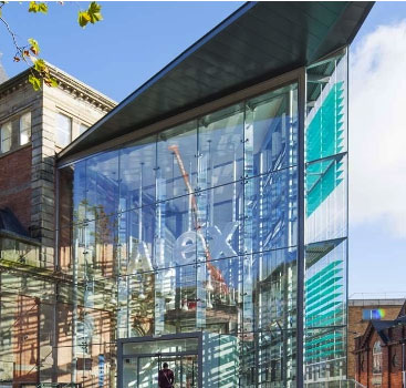
Having read about the building on the train journey from Paddington,  I was looking forward to see how the architects had integrated a modern glass extension onto the original building which was contructed in 1887. I had been told the campus was five or ten minutes from the station, and so taking directions from customer services in the station and following the map on my phone I was slightly bemused when, twenty minutes later, I found myself still walking up an interminable hill looking for the open campus I had imagined from looking at the architect’s image (above).

When my mobile told me I was at my destination, I knew I had been misdirected. It was the wrong building! It turned out that the School of Glass was at the bottom of the hill right in the middle of the town centre – I had been directed to the School of Art surrounded by space at the top of the hill. Don’t you just love those architects’ drawings which blank out the hustle bustle of the surroundings?! I must have walked right past it staring at my mobile!

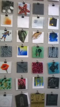
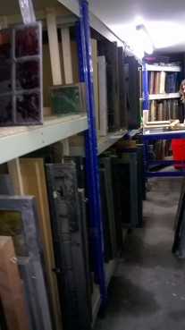
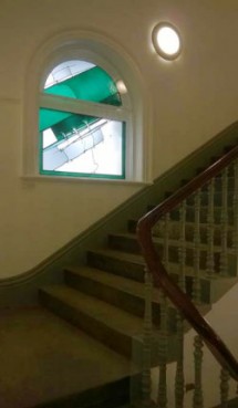
Anyway I finally joined the other judges on the tour around the building led by Dr Vanessa Cutler who runs the degree and PHD courses in glass at the University. Our group was later described as “kids in a candy store” looking at the facilities, and it’s not surprising – I was wildly envious going from room to well-equipped room full of what looked like brand new equipment! It was like being taken into a stained glass treasury when we descended into the basement store, packed to the gills with racks of sample glass panels from previous Stevens Competitions. We joked that somewhere within the warren of rooms would be hidden an original Johannes Schreiter panel, but in fact we only had to look up to see a Schreiter panel installed in the staircase to the Glass department, a legacy of the time in the 1970’s -90’s that German Masters came and worked with the students in the School.

Reading Room

Image: www.southwales-eveningpost.co.uk

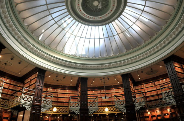
The last room we visited in the beautiful grade II listed building was a stunning circular reading room, once the Swansea Central Library, temporarily used as a Doctor Who set and, after the building was acquired by the University, briefly used as a leading room for the Stained Glass courses. The architects had applied a light touch when renovating this splendid Victorian interior, though they had managed to shift the entire entrance porch a metre forward into the space to allow for disabled access.

After a jolly lunch in the Dragon Hotel down the road, we disbanded again embarking on our various train and car journeys back to our respective homes around the country, and agreeing to meet again in Southwark Cathedral in April for the judging of the compettion.

Alex

Image: www.b4ed.com

On the train on the way back, I looked at further online images of the lovely building and realised with some irony that there had been a big clue calling out to me to announce the location of Alexandra Road campus…. I managed to walk straight past an enormous sign with letters four feet high saying “Alex”.

Doh!