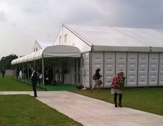
I wasn’t relishing the journey to get to Decorex 2014. It’s former location in the grounds of the Royal Hospital at Chelsea was minutes from my old flat, but Syon Park for goodness sake?! But a remarkably smooth journey – involving three trains and a (complimentary) coach ride – later and I found myself standing outside a rather bleak looking tent in a bleak field on a bleak day, looking forward to seeing the treasures inside.
The entrance to the show lead visitors past a series of eight contemporary vignettes based on scenes from The Rake’s Progress by Hogarth. It was an odd conceit, the point of which wasn’t clear until I looked it up later on the Decorex website and discovered there was an association with the Sir John Soane’s Museum. However the realisation of these concepts was little contrived and seemed little more than an opportunity for some product placement.
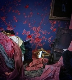
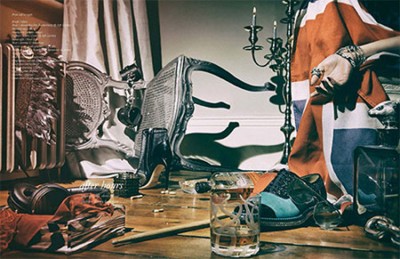
The one set that caught my eye was The Orgy by Russell Sage (above left), though perhaps for the wrong reason. It reminded me of my friend Huma Humayun’s styling on the After Hours shoot for Schon magazine (above right), but where Huma’s styling was considered and artful, I thought Sage’s interpretation of the brothel scene just looked like the pile of clothes on my bedroom floor before I put the washing on!
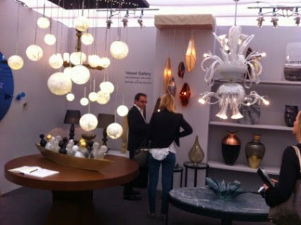
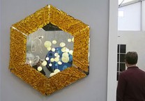
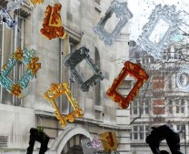
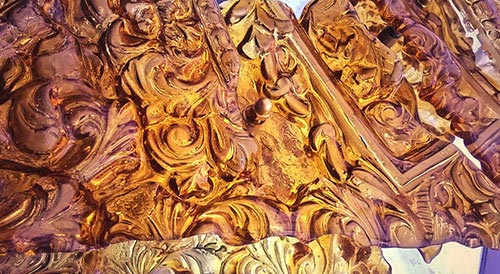
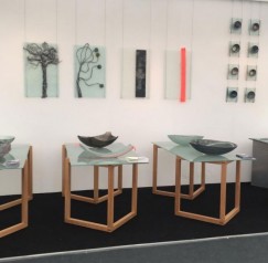
However once inside I was more impressed with the exhibitors’ stands. My favourite was the Vessel Gallery stand which displayed a gorgeous collection of various glass pieces, including my friend Brett Manley’s fabulous cast glass mirror (detail, above). Brett’s work has always drawn inspiration from many different sources, but her hexagonal mirror is quite clearly the culmination of her work casting glass from ornate picture frames, something that she started in 2010 for our show ‘Era’ at the Cochrane Gallery.
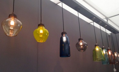
My eye was of course trained for other makers that I know, so I was thrilled to see a beautiful display of glass pendants in various shades and shapes from Michael Ruh at the Design Nation stand and I couldn’t miss Eryka Isaak who filled 10 square metres with her huge glass bowls with a tough industrial edge.
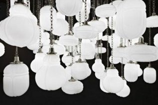
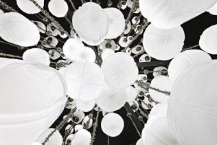
Most spectacular was Christoper Jenner‘s Cloud installation made from his blown glass ‘Urbem’ lights (above) which, as Christopher himself explained to us, were inspired by the meeting of craft and technology in 19th century street lighting in Milan. My glass radar had quite clearly been switched on as I noticed the same lighting in use on the Lapicida stand.
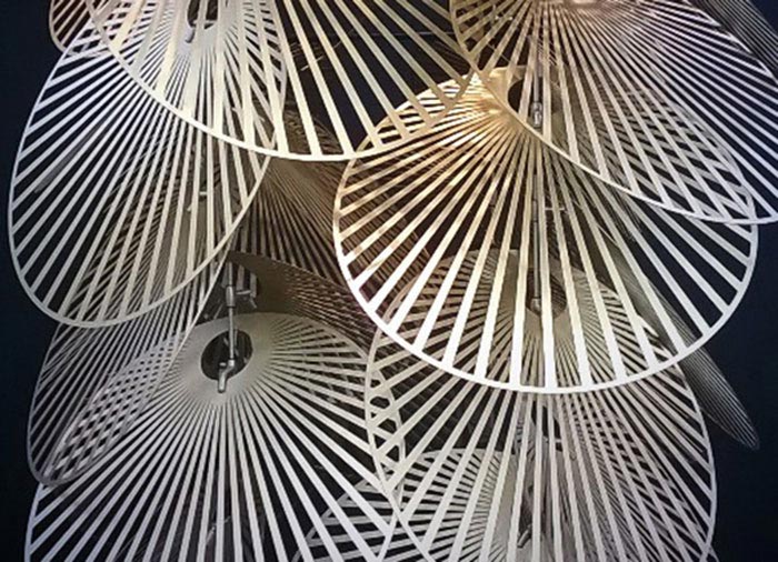
Finally another favourite from the show appeared to be lighting of some sort from Studio Lucid but hung like a sculptural installation within its own little walled off section at the end of the Heathfield & Co stand. I stood for a few minutes trying to work it out but, because of the wall, I was as invisible to the stand holders as they were to me and no one came to relieve me of my confusion… perhaps a lesson that though the stands rightly should look beautiful, practicality has its place too?
